Catching up from last week (hey sometimes even the Mets Police have to do some Actual Work), Paul Lukas did a long Mets-themed post about the 86 Mets caps, but what really aught my eye was….
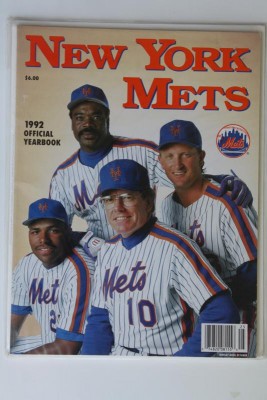
I do remember noticing that the blue got darker in 1993, And I also knew that the pinstripes changed from zigzag to straight, but I didn’t realize that the pinstripe spacing had changed.
Source: What Was the Deal with the Mets’ 1986 World Series Caps? | Uni Watch
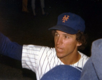
…now in my circles we have discussed what we call “electric blue” (our youth) vs Dodger Blue (the current blue and the Casey blue)….and someone might even jump in and say I am wrong about all that (in summary, to my eye, the blue – especially on stuff kids wore – looked lighter than it does now)….and David Howard and I had a big discussion about the blue years back…..anyway Paul has re-opened the Blue Got Darker discussion.
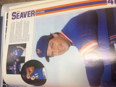
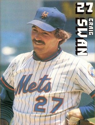
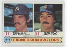
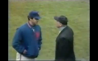
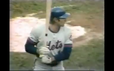
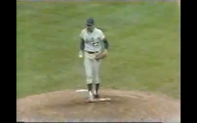
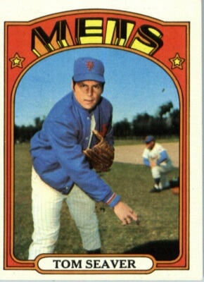
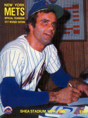
As you can see from the above completely disjointed paragraph that my brain exploded. Anyway….great topic. Here’s some random stuff below….the Seaver card looks lighter to me…the Swan stuff looks lighter and very much how I remember the Mets looking…..other than that look at Torre 77 or Seaver 83….the blue looks like it does now.

More images after the break so I don’t slow down the home page
