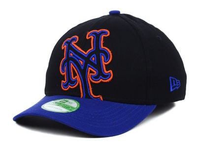
An interesting twitter discussion I was tagged on. I can’t take credit for any of this, and I won’t be surprised if Paul Lukas does a proper version over at Uni Watch – but thought this was fun and thought I’d share….
Interesting little error on the embroidery on the #Mets Mother’s Day cap that I have. They overlapped the “N” over the “Y”, when on all regular caps, it’s the “Y” that overlaps the “N”.
Curious, though, which way is correct?@UniWatch @PhilHecken @Mediagoon @metspolice pic.twitter.com/JLcSnunPoO
— Niko Goutakolis (@NikoMetsPlus) May 13, 2018
Agreed with Paul — I’ve mostly seen it rendered “flat” (no letter over or under) but I have seen it with both the “N” and the “Y” as *on top*. pic.twitter.com/ztGDnsCeam
— Phil Hecken (@PhilHecken) May 13, 2018
All versions shown in the MLB style guide are flat. No top or bottom letter; the letters simple intersect on the same plane.
— Paul Lukas (@UniWatch) May 13, 2018
Seems like Y over N is the rule, to which there are exceptions… Sort of like I before E except after C, which is weird because its not wierd. pic.twitter.com/IvvgQ07O83
— Andy Harris (@paperboyarchive) May 13, 2018
Here is a cap worn by Casey Stengel during the 1962 season. I think that give the definitive answer. Y over N. pic.twitter.com/prNy15RogK
— FromTheRedSeats (@metsnark) May 13, 2018
