All of our work and hustle is for the city across our chest. #OurColores pic.twitter.com/xFlzCJKPCj
— Miami Marlins (@Marlins) November 16, 2018
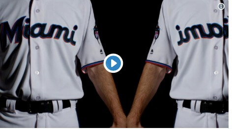
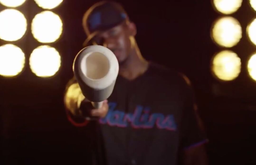
The Marlins have new uniforms. These images I sourced are from a video (above) with 8 trillion jump cuts and weird lighting designed to not give us a good look but let’s see what we can do here…
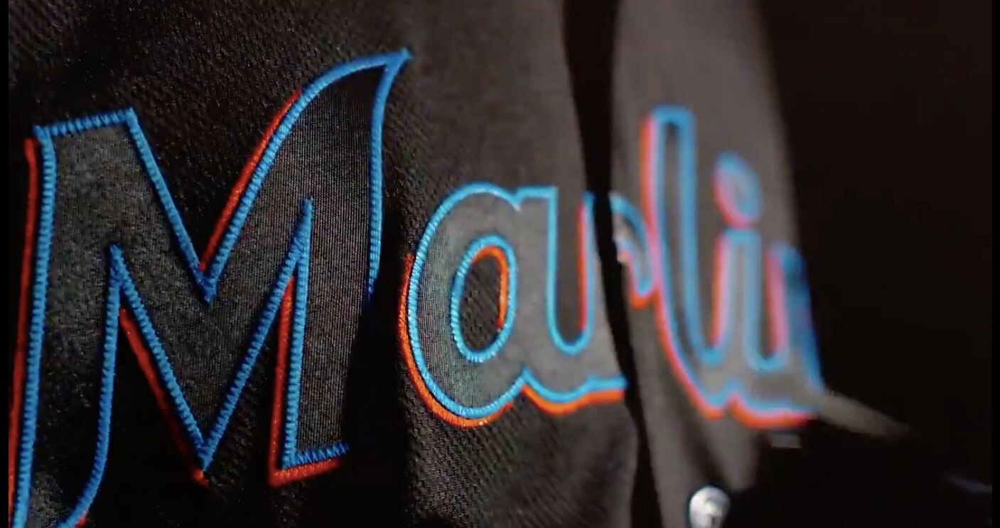
I am not digging this font. The M is ok but by the time we get to the ami it looks kinda fishy. (The below is not a video, its a still so I could get a good look)
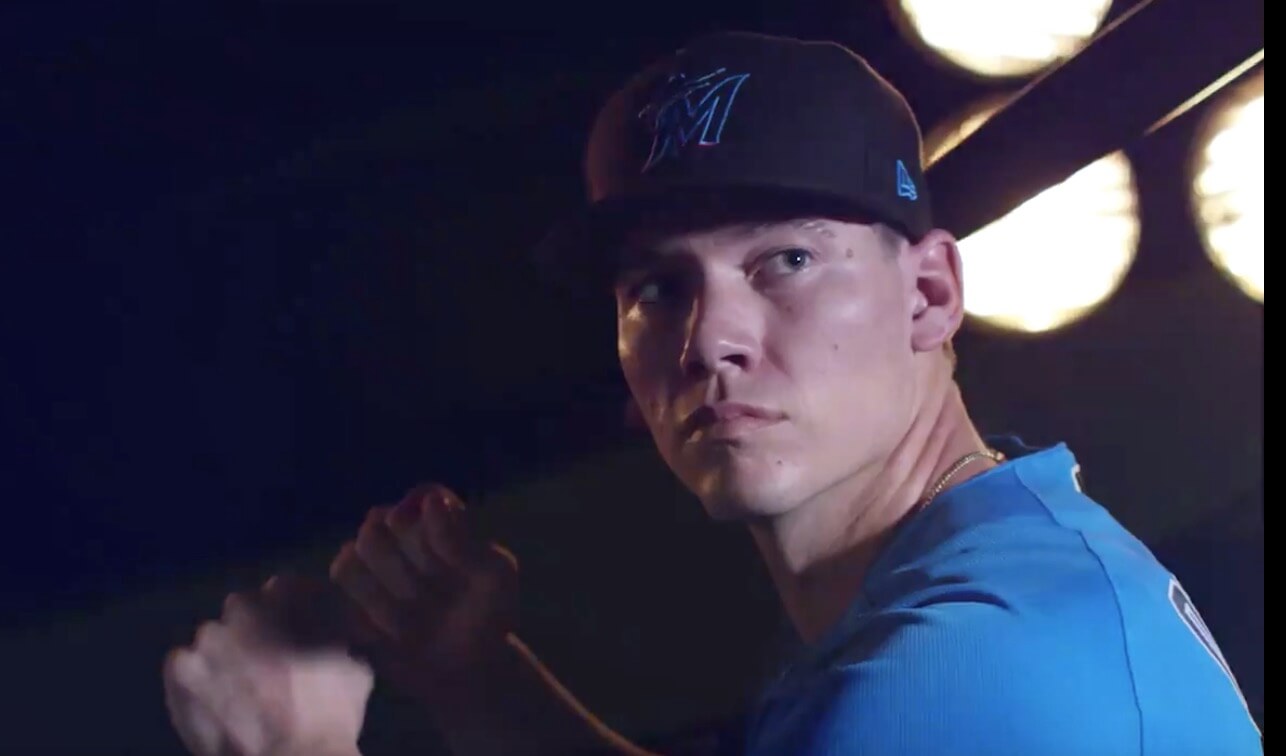
This cap has the same issue the Mets hybrids had. It might look cool on a civilian, but as you can see in this photo, the logo disappears. As we shall see, this is a major problem in this set. How’s that gonna look from more than 5 feet away?
I’d like to see more of this blue. Both above and below make me think these might be the prize.
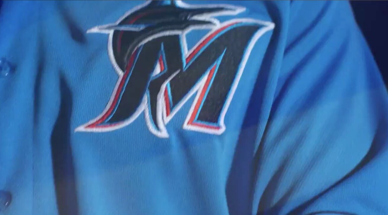
Oh and good luck unseeing the kicking leg at the bottom of the M now that I pointed it out.
Then there’s the black. Now here me loud. This is a great looking fashion jersey. This will loo good on a civilian. On field though….it’s the hybrid problem. Are you even going to be able to see the letters from the stands?
And here’s a different black. Note on this one the blue is filled in, above it is not. How many jerseys does this team have? Anyway, the Black/Blue has all the issues the Mets black jerseys had. It will disappear. It will trick your eyes and make the blue look purple. It will look bad in a game, good on a civilian.
I think the Marlins swung for the fences here and flew out to the track. These are ALMOST really cool, but I fear they are a disaster.
Update: a better look is available. Not looking good to me.
All of our work and hustle is for the city across our chest. #OurColores pic.twitter.com/xFlzCJKPCj
— Miami Marlins (@Marlins) November 16, 2018