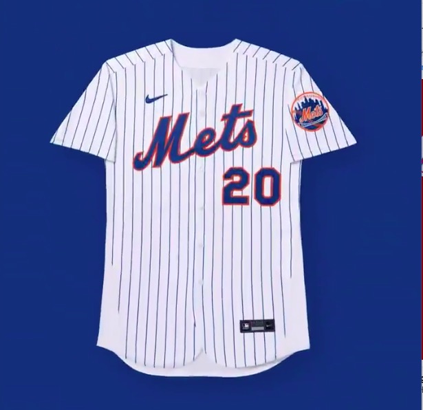
Y’all oughta load up on the remaining stock of Swooshless Mets Jerseys using my snazzy Affiliate Code because you will never have a nice clean looking jersey again.
MLB just tweeted about their new corporate sponsor logo creep and included this image.
And now let me annoy you for the next 20 years….The swoosh tilt and the M tilt are not parallel.
NOW YOU CAN’T UNSEE THIS MWAHAHAHAHAHAHAHAHA. That’s for you Paul. You can’t unsee it. MWAHAHAHAHAHAHAHAHA.

Oh and the blues don’t appear to match. MWAHAHAHAHAHA.
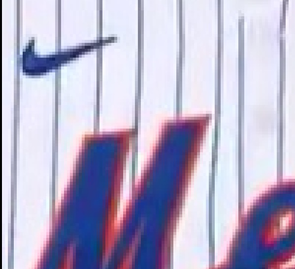
And look again at how the whole thing title your eyes to the left now. Focus on the number. Don’t you want to tip over to the left side of the image? The number USED TO counterbalance the weight of the M. Now with the non-parallel different blue swoosh, I get dizzy looking at it.
MWAHAHAHAHAHAHA
HAHAHAHAAHA
HAHAHA
Ha
chuckle
snort
At least when the Wilpons owned the team we had nice uniforms from 2012-2019. Thank you Wilpons.