Megdal for GM on ‘Better Seats, Lower Prices’ (and some Mazzilli)

Howard Megdal who is running for Mets General Manager has a theory on the campaign, and how he will change it if he is elected as GM.  Under my Honor Among Bloggers code, it would not be cool to tell you what he came up with so you’ll have to read it here.

Medgal and I exchanged some tweets last week.   I have publicly stated that I don’t know if I can support this guy if he is going to wear black t-shirts in his ad campaigns.

If I do choose to support him, I have some terms:

1.  No black uniforms. Megdal will say the GM has no say over that.

The starting pitcher chooses the uniform.  The GM picks the roster.  Pick guys that hate black uniforms.  Very simple.

2.  Lee Mazzilli Poster Day II.

The first 25,000 people in attendance get a replica of the original Lee Mazzilli poster.  If you’re old enough you’ll dg it, if you are too young you will throw it away and I will just pick yours out of the garbage.

I need a Lee Mazzilli poster.  I can’t even find an image to share with you.  If you Google “Lee Mazzilli Poster” all you get is some idiot calling himself Mets Police talking about the poster.

I did find this cool article from New York Magazine in 1980 as I hunted.  Check out the Lee article on Page 10 called Urban Centerfielder.   Lee was the MAN in Flushing for a brief time.  Great article – I didn’t know Lee loves (loved?) Space Invaders.  I love Space Invaders.  Man, imagine me and Lee at an arcade with a roll of quarters in my pocket (made you laugh).   Also, what’s with this Joe Torre guy moving Lee to first base?  That guy stinks as a manager.

Oh yeah, I digress….Megdal for GM

Weird Mets Fonts explained

Steve posted the below as a comment.  My fact-checking service today is a fat guy on a deck eating a footlong sandwich from a place that could advertise, much like that donut chain that shall go unnamed…here’s either some good info or today’s winner of Creative Writing:

Shannon,
The weird font you see on the Reyes jerseys was the standard font used by Majestic on all their replica jerseys pre-2009. They used a generic font, sewn on the jersey in a single layer of twill, for both the name and number. So regardless of whether you got a “Reyes – 7″ on a Mets jersey or a “Drew – 7″ on a Red Sox jersey, the fonts were exactly the same. The only difference was in color. For the home/road/snow, they used blue and for the loathsome black jerseys, they used white. Last year Majestic switched to what they advertised as the “All New Replica”. They replaced the generic name/number fonts with a single layer of twill, that had the different colors screen-printed on, to make it look like the two-or-three layers most teams use. They also switched to team-specific fonts and a team specific jock tag on the front. So, an improvement but still nowhere near the quality of an authentic jersey.

Steve

That 7 with the bottom cross-bar drives me nuts.  As someone who is inherently cheap I can’t kill people too badly for not buying top of the line stuff.  If I ever let Osh41 nitpick the stuff in my closet he’d throw most of it away.

Speaking of closets – Mrs. Mets Police has yet to comment on there being an orange jersey and a green jersey and a new cap floating around…she’s not that dumb, I guess she figures it’s better than dropping $75 on booze.   My green Murphy jersey is dumb today but will be awesome in a few years.  The orange one is waiting for Osh41’s BBQ…when is that again?

This Steve fellow seems to know his stuff.  We will have to pick his brain some more.

Once again I am amazed at the amount of stuff this site can talk about without ever getting into talking about the actual game.   Earlier today I was daydreaming about the Mets announcing no-black for 2011 (they haven’t announced that, it’s just a fantasy I was having) and how I’d just post a giant picture of the VJ Day celebration in Times Square.

You think Paul Lukas from UniWatch ever looks at this site and rolls his eyes the way I do when my kids try to explain Star Wars to me?  Yeah, I know about Anakin…


Cyclones Wear Fan Designed YOUniform – I Like

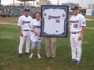
Last night the Brooklyn Cyclones wore a new fan-designed jersey which I really liked.

Joanna Del Priore won the YOUniform Design Contest that the Cyclones sponsored as part of their 10th Anniversary celebration.  I only have the one picture (from the Cyclones Facebook page) but it looks very clean (blue pinstripes) and incorporates the Cyclones colors without being garish.

The part I like most though is the new stylized B in the Brooklyn.  It’s a bit classic but doesn’t evoke the Dodgers which is a fine line when designing anything for Brooklyn.

If I had to nit-pick one thing about the jersey it would be putting Brooklyn on a home jersey.  That said however if the Cyclones were to put this on sale I’d probably buy one.

Greetings, Ron Hodges etc.

I couldn’t think of a proper title for this post so I went with the email title which is strangely catchy.  If I ever start a Mets cover-band I may call it Greetings Ron Hodges Etcetera.

This email came in:

Shannon,

Was checking out some Mets fan sites and came across the following…

https://metspolice.com/2010/04/04/pictures-of-mets-hall-of-fame-and-museum-uniform-display/

And right smack dab in the center of the story was the Ron Hodges jersey that I currently own and have on loan to the Mets museum… and I laughed hard!

My name’s Nick and I’m a life-long Mets fan and collector. Over the years, I have built a collection of game used Mets jerseys, but it’s not exactly a collection centered on the stars… My collection focuses more on the odder and rarer styles the Mets wore on field, including a few different blue alternates worn from 82-84… and through networking with other collectors, I’ve built a small reputation within the hobby as the ‘oddball jersey guy.’

Earlier this year I was contacted by the Mets to showcase one of my jerseys in their museum. Their plan to provide the fans a chronological uniform history was missing 1 key piece — the blue alternate, and that is just what they contacted me for… So after giving them a choice of jerseys, they zeroed in on Ron Hodges.

Fast forward a month and that jersey is in the feature photo of your blog… Surrounded by big ticket items in a display including jerseys worn by the likes of Seaver, Stengel, McGraw, Hernandez, Wright, etc., it was comical to see that Hodges got the spotlight photo. Well, after all, it’s a quirky style jersey, but it’s Ron Hodges! Who else could be lucky enough to win a World Series ring in his first year with the team but unlucky enough to not graduate from the ranks of back-up catcher for the next 12 years? After all, isn’t he that perennial underdog that us Mets purists root for day in and day out???

I think we’re going to have to spend more time in Nick’s closet, don’t ya think?

The Mets Police
Privacy Overview

This website uses cookies so that we can provide you with the best user experience possible. Cookie information is stored in your browser and performs functions such as recognising you when you return to our website and helping our team to understand which sections of the website you find most interesting and useful.