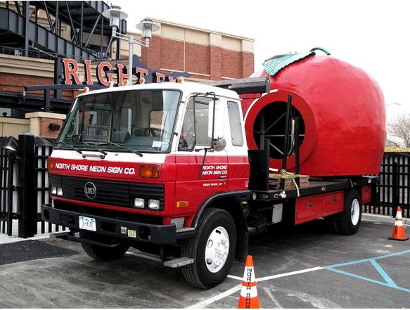
 The Apple (real version) is moving to a new home in front of the rotunda!
Big thanks to Chris for sending this over!
I guess we know where the Blue Cap Army will meet.
Later today I have some minor yet interesting news about the Mets museum.
Click here for several more pictures of the Apple on The Move. Thanks Chris!

Even though I hate the apple (always thought it was a “second rate” way to celebrate home runs), I’m obviously in the minority. So, since I’m “stuck” with it, here’s an idea to “improve” it. Why not have the signatures from all the Mets who are in their Hall of Fame placed on it? You can even make it part of the ceremonies when newer players are inducted.
For me, the Apple came along in 1980 (right? my memory gets fuzzy) so the little boy in me likes it. Not sure how old you are, was it “always there” for you or are you older than me?
Apple’s a little cheesy, but it fits with the Big Apple/NYC theme that the Mets and Citi Field are.
Always been there for me though, so it’s not like I know any different.
As cool a place as it is to meet, it’s going to be a popular and crowded one.
Yea I don’t know anything else. My youth at games always consisted of hoping to see the apple pop up.
I thought it was incredibly dumb placing it in the bullpen plaza last year. This is what they should have done all along. I know people want it in its original location but that would put it probably in the middle of the parking lot which like the marked basis makes no sense
I like the bullpen plaza area. it’s a very neat area with being able to see th bullpens, and the tables, the banners, the apple. But no one goes in there yet. However, when they bulldoze the chopshops and have that as an All-Star village, that’s where all teh tourists will come in.
I guess I’m a bit older than you folks, as I can vaguely remember the ’69 series (always thought of it as my brother’s WS (he was 4 years older) and ’86 as mine). So, I do remember a time when that hideous thing wasn’t out there.
I also remember the days when the video screen at the top of the orignal scoreboard worked, and Mayor’s Trophy games, Banner days, scheduled double headers, the art deco squares on the outside of the ramps, the green outfield wall, sharing the stadium with the Jets, the Serval Zipper tower being visible from the stands (now a UHaul truck rental place), and standing on the subway platform with a clear view of the field (we’d always stop there, whinning to our dad, who wanted to “beat the crowd,” to give us just a few more moments to see the game).
But, again, having to live with the apples, how about adding the signatures of Mets HOFers?
Ceetar: cheezy yes, but, what “Big Apple theme” do the Mets really have, other than the apple itself? I don’t really consider the scoreboard skyline as part of that. I’d be all for it, if Apple had bought the naming rights to the new building – that’d be a tie in, though I thought MetLife would have been best. After all, that’s what we live…a Mets life.
Mike, I’d love to hear more about the small video screen on the Shea scoreboard. I never saw it in action, it was always a clock in my time.
I’ll tell you youngsters, when Diamond Vision first showed up it was like Wow!
I miss the squares. That will be one of the defining features of Lee Mazzilli Park when I buy the Mets in 2060 and build a new stadium where Shea was.
Does anyone know whatever became of the wall Gooden signed?
Mike,
The Mets logo is representative of the city, hence the Big Apple theme
“The shape of the insignia, with its orange stitching, represents a baseball, and the bridge in the foreground symbolizes that the Mets, in bringing back the National League to New York, represent all five boroughs. It’s not just a skyline in the background, but has a special meaning. At the left is a church spire, symbolic of Brooklyn, the borough of churches. The second building from the left is the Williamsburg Savings Bank, the tallest building in Brooklyn. Next is the Woolworth Building. After a general skyline view of midtown comes the Empire State Building. At the far right is the United Nations Building. The Mets’ colors are Dodger blue and Giant orange, symbolic of the return of National League baseball to New York after the Dodgers and Giants moved to California. Blue and Orange are also the official colors of New York State.”
The bridge motif around the park. Big Apple brews (yeah, just names, I know) They identify as “New York’s National League baseball team”. One entrance reminds one of Ebbets field, the wall/seats color scheme is of the Polo Grounds.
I think the Mets should be beyond “New York’s National League baseball team” identity. They have their own colors and history. They are the NY Metropolitan Baseball Club, hence their history and colors should dominate their stadium, without forgetting their roots.
Can we just get rid of that cheap second grade piece of paper mache garbage once and for all? I’m embarrased it has even taken on any sort of symbolism to the team I have been following since 1967.
Have to think the apple will be in the back of the rotunda, cant see it way up front. I bet with bullpen renovation, the apple lost some of its space.
The apple in the parking lot where it was at Shea is an OK idea. Think Mets should have a Orosco and Cleon Jones statue in parking lots of the final outs in 69 and 86. Jesse in his Victory pose and Cleon on one knee as he catches Davey Johnson’s fly out.
And guys, I always got the connections to NY City, but the apple is the only connection to the 1970’s ad campaign. Either way, I’m going to have to live with the cheesy things.
Shannon: It seems to me that I was between seven and ten years old (approximately ’64 to ’66; the World’s Fair was around for part of that, and many of it’s buildings were still there in the years afterwards) so, my memory might be playing tricks on me, but, I’m sure I recall the Mets players pictures, and only the Mets, coming up on that screen while the stats were displayed on the main screen itself. Of course, it was only used for night games (remember also, that there were fewer night games back, even during the week, as there was less media involvement, and almost every Sunday was a scheduled doubleheader; we usually went to Sunday games, for the joy of a full day at the park, and for a ‘bargain price’ of two games for one admission).
I also seem to recall it was a somewhat dark screen and certainly not visible from all parts of the park (imagine a seat not having a complete view of everything in the stadium), but, at the time it was “state of the art.”
PS – Please don’t sell the naming rights to your stadium….as I sure you’re well aware, the honor belongs to William Shea.
Wow I forgot about the Big Apple ad campaign. You’re right – that was marketing. That one sure stuck!
Didn’t see BuddyReyes’ comment before. Way to go BR, but, I think we’re in the minority, at least here in the blogosphere. Seems to be, that liking the apple is a generational thing.
Shannon, why not an ‘impossible poll?’
Good suggestion for the poll! I didn’t know there were those who didn’t like the apple.
From what I’ve read, the screen wasn’t a video screen, it was more like a big slide projector. It didn’t work too well and was scrapped several years later.
Here’s a picture: http://www.forgotten-ny.com/STREET%20SCENES/shea/old.1965.scoreboard.jpg
Shannon, your memory is a little hazy. The clock was to the right of the screen, which they turned into a big Mets logo
http://www.forgotten-ny.com/STREET%20SCENES/shea/old.oct.16.jpg
and then sometime in the 80’s they put the neon skyline up there instead.
re: that first pic of Corey’s, can you imagine them posting someone’s address on the board these days?
I used to enjoy watching it take half an hour to post a message. They had to scroll through each letter, like putting your name up on Asteroids (too old?) and the message would wind up being like (wiith typos)
THE MXTS INVITE YOU TO BANNER9DAY ON SUNDAY JULY 18XH. THE PARADE BEINGS AT 12:30 AND GAME TINE IS 2:05
Corey: thanks for the pictures, and your description is dead on.
The other thing they once had on the scoreboard and late got rid of was that there would be lights on the left and right sides (where the pepsi ads were in the last years of Shea) synchronized to the organ music.
Corey I don’t recall colored lights at all. Cool.
Weren’t they different colored lights?
I love the Apple. Whenever my 3 year old sees a baseball game on TV she says “Daddy, is the Apple gonna come up?” She is already claiming the Apple that they are giving away Opening Day for room, because “Daddy has to much Mets stuff”
Kids love that apple man. I guess adults enjoy Mets home runs too.
Junior has gone from wanting to go to the game to not wanting to miss school (WHAT?!) and back to wanting to go because I mentioned a shake. Now I have to tell him that there’s no shake shack in the Promenade. There goes 4 innings.
Joe, you had better give her the damn Apple, or you’ll be hearing about it when she’s 30. Plus, it’s always good to lay down an early strong foundation when creating a lifelong Mets fan
They were different colored lights, I believe blue & orange.
Also Shannon, you were right. I was watching the 1980 yearbook yesterday, there was a digital clock in the top middle of the scoreboard there at that time. I guess it only lasted a few years.
I haven’t gotten to Yearbook 1980 yet. I keep taping things in HD which fills the DVR quickly, so things like Yearbook tend to wait…then whenI start watching I start blogging and then three hours go by…kind of like this morning!