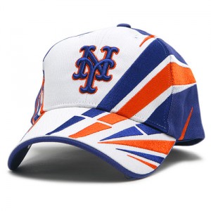
 If the Mets ever want to annoy me they should wear these and just shrug their shoulders that I wanted blue and orange and no black and that all I do is complain.
10 Replies to “Annoying Mets cap that doesn’t violate my rules”
Comments are closed.
What Mets fans talk about when not talking about the actual games.

 If the Mets ever want to annoy me they should wear these and just shrug their shoulders that I wanted blue and orange and no black and that all I do is complain.
Comments are closed.
If given the choice, I’l take black. This is just… wow.
Not a fan of this. (I’m very anti-white though)
This almost looks like a golf hat.
I think we are all in agreement that white belongs on uniforms, not on caps.
Do I need to remind everyone of the “Ice Cream Man” caps?
Well, yes I do like the colors. I too feel there’s no place for black in our uniforms. I would’nt wear it at a game though.
This is horrific, I and consistantly wear the all orange jersey (Strawberry) to the park throughout the season. You still wouldn’t catch me in this, even if it came from a promotional giveaway. This is like an NFL cap I’ve seen of the Broncos. Last year I noticed a cap in the Team Store that basically made us the Arizona Mets or the New York Diamondbacks, take your pick.
This looks like the hat of a UFL team. Let’s keep the hats simple…just the logo and a background color please.
Either Mets Police has picked up some new readers or this cap is really terrible.
Wow… is the Zubaz era trying to make a comeback?
I had the same thought at Paul. i had trouble in Port St. Lucie finding a replacement for my all blue, adjustable, Mets hat. nothing quite like this though, but close.
ONE WORD: FUGLY!