 I have been enjoying the guest posts. Here’s a fun one!
Hi Shannon,
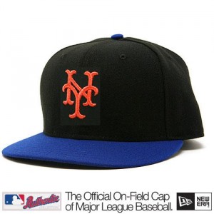
I am not a graphic artist, so the attached picture is just a quickie cut and paste. To my surprise, at first blush, the cap doesn’t look as good to me as I thought it would.
What do you think?
Michael
I will split my comment:
1. If black must exist in the name of marketing and they insist on wearing black – then YES this is the move. My biggest problem with the “hybrid” (I love that that term has caught on) is that you can’t see the NY on TV. It looks like a blur. In person on a civilian it pops more, but on an actual major leaguer the NY doesn’t stand out. This design solves the problem.
2. Ditch the black. Dress the team in blue, let civilians wear whatever they want – New Era has tons of options. If I ever have free time on a weekend again I’ve been jonesing to do another round of alternate cap commentary.

I’ll refrain from commenting on this to see what others have to say.
Black and Blue was an underrated mid-70s Stones album – makes a totally hideous baseball cap.
michael, nice job with the cut/paste.
while i understand that this says “giants on top, mets on bottom” i just think the whole idea of a black crown with a royal blue brim is a flawed idea. the mets don’t need TWO black hats. if they must have one, then keep the all black and retire the hybrid.
I like the effort in trying to find a solution to the hybrid.
But as noted by others, the hybrid is a terrible concept with the black and blue color combo.
As a test, I would be interested in seeing a Navy Blue (not the current “Dodger Blue”) crown with an Orange bill — no black at all.
Navy blue = Yankees. Not thrilled with that prospect.
I still think, IF a black hat is deemed necessary by the powers that be, the old school NY Giants version should be used by the Mets. http://www.lids.com/pid/1099788
Some even call this hat a Mets hat
http://www.amazon.com/York-Fitted-Baseball-Large-Black/dp/B002JM1EN4/ref=sr_1_1?ie=UTF8&s=apparel&qid=1272991304&sr=8-1
The Mets have borrowed enough elements from the other NY teams that this is not a big deal.
While I agree with you, I do wonder what sort of rights the SF Giants have to this particular design that may preclude the Mets from using it.
I could live with that, but I’m with Brian in that they simply don’t need 2 black caps.
I do like the idea of a designated road cap, but nobody ever said it had to be black. As long as they have the black alt jerseys, they’ll have a black on-field cap to sell. For the road, they could go with an orange bill or my previously proposed grey crown instead: http://216.77.188.54/coDataImages/p/Groups/313/313872/folders/300733/2415420nl1997newyorkroadcap.GIF
And then there’s this idea. Just combine the 2 current black caps into 1:
http://www.lids.com/pid/20147390
Some of you may recall that such a cap has already seen the field, albeit by apparent accident:
http://www.uniwatchblog.com/2007/05/30/craptastic/
@sparks good one, will use tomorrow. I wanna space out the caps talk.