Osh41 continues his series of looks back at Mets uniforms.
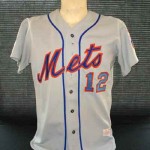
Inspired by ‘Mets Yearbook’ 1976 I present another look at Mets jerseys from the past – the 76/77 home and road.
Best way to describe the road version – WEIRD. The Mets script looks very different from the 74/75 versions (see yesterday’s post). According to the excellent MLB Game Worn jerseys of the Double-Knit Era (by William Henderson) the Mets changed unifrom manufacturers for the 76 and 77 seasons.
Maybe the new company wanted to put their own unique stamp on the uniform? They sure did.
The jerseys look terrible. Not as bad as the black but pretty close. Another word to describe? SHABBY.
The home jersey thankfully was unaffected by the manaufacturer change.
 Some notes from 1976 – on the home and road jerseys the Mets had a black armband memorializing the offseason passings of original team owner Joan Payson and original manager Casey Stengel. The team had previously worn black armbands during the 1972 season in memory of Gil Hodges who passed away from a heart attack just prior to the seasons start.
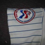
The team also wore bi-centennial patches on the right sleeves of the home and road jerseys. They also wore pillbox style caps throughout the season.
Next, the year was 1978 and the Mets were entering the first season of the post Seaver era. So what did the Mets do? That’s right they changed their uniforms!!
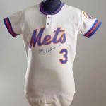
The 1978 -82 home and road 1978 -81 uniforms were a drastic departure from Mets uniforms from 1962-1977. Gone were the button up jerseys, they were replaced by a pullover style for home and road with two buttons at the top. The sleeve edges and collars were graced by a blue/orange/blue border.
Hey it could have been worse, at least they kept wearing belts and not the awful snap pants like many other clubs of the era.
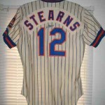
 In 1979 the Mets introduced (much to my dismay) names to the backs of both road and home uniforms. The names were stitched to a nameplate and then stitched to the uniform backs which looked kind of awkward on the home pinstripes.
The rest of the MetsPolice and I are big advocates of the no name on back style at least at home: if you don’t know your team by uniform number alone you should rethink your fandom. And hey Fred and Jeff: make people buy scorecards!
For fans of MetsPolice and my generation these uniforms represent absolute futility. Arguably the worst era in Mets history. Trust me on one you fans born post 1986. The early Mets of the 60’s were at least lovable. They were an expansion team after all. They were expected to be bad. This uniform experienced no glory at all, just punch lines.
As a kid, I didn’t mind that 2-button jersey so much…I even had a replica of it. You could not easily find an authentic jersey back then. I do believe the Mets were the only team ever to wear a two button style.
Steve isnt it cool that we can jusy buy jerseys now? As a kid I would have loved to have one.
As an adult I’d love to have a 1978 Mazzilli road. Because I am weird.
in 1973 the mets had a patch on the wind breaker and wool jackets.
i can never make out what it said from the pictures i have seen. do you know what it was?
God, those unis in 78-79 are gory.
thr mets trainers wore pearl white jackets. they looked great against the bright orange “ny”