Paul Lukas who writes the awesome Uni Watch (more on that below) and Fire Wayne Hagin Already (Mets Police doesn’t try to get people fired but does laugh at Paul’s points) was kind enough to send this one over…which came to him from reader Steven Presser.
Steven said he got an email from the Mets about group tickets which included a power point about the hospitality suites. (I have the powerpoint).
Ok so what. Who cares Shannon?
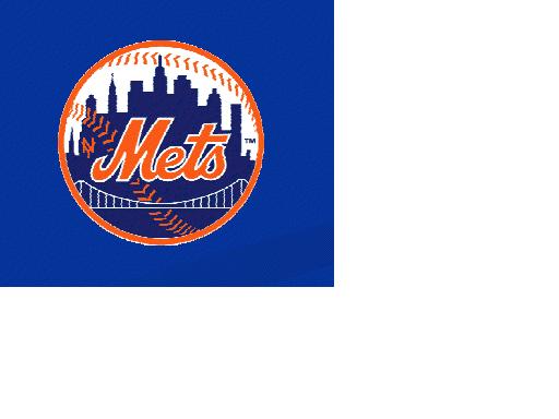
Well, let’s zoom in on that Mets logo, shall we?
No that’s not my best formatting job but I’m knocking this out before Real Boss shows up. Anyway, note the NY in the ball logo.
Steve points out that it is likely that Timmy the Intern grabbed some random Mets logo off the internet and also unfortunately that later slides don’t include the NY…
..however, a boy can dream. Once again I will remind Fred, Jeff and Dave from Flushing that the 50th anniversary in 2012 gives them the perfect excuse to hit the Bobby Ewing reset button and go back to basics, and that should include the NY.
I never understood why the NY left. I get the black. The NY? Because stitching is expensive? Orange toner in the printer is expensive? Why not use it in printed materials?
Anyway…this is a fun discussion for a quiet January day and maybe it starts a discussion out in Queens. Hi guys.
….
As for Uni Watch. You should read it every day. If you at all like the black uniform discussions over here, Paul is the king of the war against the black and has been railing about it for years before I came along. I’m trying to find the one post where he destroyed the Wilpons (someone will send it to me – shannon@metspolice.com) – but here’s one from 2009 you’ll like.
I hope some day Paul sits next to me in the subway car at the signing of the Treaty of Flushing.

