90s Mets uni looks so retro now

Kevin did this screengrab of mets.com

Look at the uniform. Guys, come on. Please. Seriously. It looks so much better without the dropshadow. How do you sit in the owners box and not see the difference.


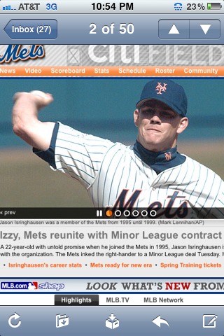
Sell whatever you want but can we please please go back for the 50th.

9 Replies to “90s Mets uni looks so retro now”

  1. I agree with Ron (I like black too in other uniform pieces, since it should have originally been a team color). Also, if retro uniforms are actually worn to celebrate great teams of the past, then this uniform has to be deep-sixed since 1995-1997 were not years to write home about in Mets history.

  2. No way!…ditch the poser black uni’s…bring back the blue & orange!

    I have no problem if the Mets & MLB want to make & sell those black crud-duds for the fans…there is obviously a demand for them. But why make the players wear them? You see the Yanks sell their caps with different colors for the fans…but you do not see their players wear them on-field!

    The drop shadow is useless…just clutters things up.

    95-97 were mediocre years, but at least they were not epic collapses like 07 & 08 while the Mets were dressed up as bruises (black ‘n blue)

  3. i loved the throw back jerseys the mets were wearing when they played the giants a few years ago.
    the large ny with the mr. met logo on the side

  4. I know this question has been raised before, but does the blue in this picture look darker to you too? A lot of the earlier period pictures I’ve seen have seemed darker, but oftentimes this is attributed to the older film, or whether it was night time, etc. This picture, however, is from the ’90s and in the sun. So what gives? Anything written on this?

    For what it’s worth, I also liked those big NY jerseys.

    I guess with a little arm twisting I could buy into the “it should have been an original color argument,” but if memory serves me correctly the NY Giants only wore black jerseys for a one off period. Their final jerseys, which continue in San Fran, looked damn good. If the mets should incorporate black into their uni’s, why not do it in a tasteful way, like the giants of old (and present). I think the black jerseys just don’t look good on a baseball field, and the dropshadow is terrible.

    1. Agreed, it could be done tastefully. Regrettably that taste is lacking. And as for the shade of blue, it’s gotten weird since the early days. In this picture, it’s almost teal.

  5. Up into the early 80’s, the Mets blue was the same as the Dodgers, basically royal blue (but yeah, bright daylight pics tend to make even that color look faded or teal like).

    Sometime in the early 80’s, the Mets lightened the blue a shade or two. Not sure if it was when the racing stripe unis were introduced or a year earlier…not sure where I read it was called ‘Mets blue’.

    The color was darkened a little in the 90’s , maybe ’93 & ’98. But if you take a current Mets blue cap & compare it to a Dodgers cap, there still is a difference in the shade of blue.

    1. My vintage late 70’s stuff had a lighter blue. Osh41 would show me pics of Casey and it would seem a totally diff blue, and was definitely not Dodger Blue circa 1978

Comments are closed.