Strictly Necessary Cookie should be enabled at all times so that we can save your preferences for cookie settings.
If you disable this cookie, we will not be able to save your preferences. This means that every time you visit this website you will need to enable or disable cookies again.

of course they are. theyve been winning with the alternates on.
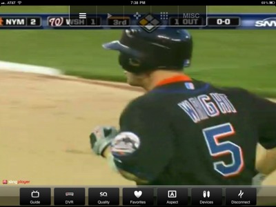
Looks like they’re just gonna wear these until they lose, which is odd considering the whole thing started with the butt-ugly hybrid look. If they were willing to change the unis from Thursday to Friday, why lock them in from there?
Seeing these on the road again does bring up an interesting possibility (which someone else probably has already come up with): if we must have black, how about blue alts for at home and these black alts for on the road? Put the butt-ugly hybrid look out of its misery and ditch the dropshadows along with that, and…
1) Dave Howard gets to keep his authentic black tops and caps
2) Howard also gets a NEW blue top to sell
3) we get the team wearing otherwise blackless unis 90% of the time.
Great idea…therefore they won’t do it. These guys are in their own universe.
We should have a home pinstripe and a road gray with no black whatsoever. Do what you want with any other combo…I don’t care. As long as I can see the Mets as I want them a few days a week, I can live with it. They will sell a lot of the blackless jerseys too I bet.
Also, please restore the wordmark from the current clownish, horrific Wilpon Script…put the little NY back on the logo…and get rid of the orange button on the cap. That’s all I ask. I bet those 3 things have not led to any more sales, so there is no reason to keep those mistakes…I know I don’t buy any Met article that has any of those defects.
I don’t know what the deal is with the drunken M, but I’m guessing the Wilpon font in general is a consequence of the dropshadow, i.e., they had to alter the lettering to make room for what amounts to a 2nd outline.
I’m with you on the orange button, but not nearly as militant about that as I am the butt-ugly hybrid look.
I can take or leave the tiny NY for most uses, but it should have stayed in the larger representations. A general rule of thumb on that would be if the logo is big enough to include detail on the serifs, keep it, but if you have to resort to making the letters out of stick figures, don’t bother.
terry couldn’t figure out that the streak happened to coincide with bay’s return? maybe all the “bad luck” was due to a gaping lack of protection in the lineup?
i stopped tweeting “#comeback” hashtags on thursday — did they think that may have had something to do with it? of course not…these black unis are gonna become another 2007 rockies in that gadawful black vest
the wins are nice, but not at the expense of looking like a glorified beer-league team
As I have repeated here many times I die a little inside when they wear this stupid uniform. If this winning streak continues I don’t know how much time I have left. You can only die a little for so long.But even if they stop wearing it tomorrow they still will be wearing black socks and belts with that stupid black and blue hat with road greys. Always a joyus look for me. Somebody stop the madness!!