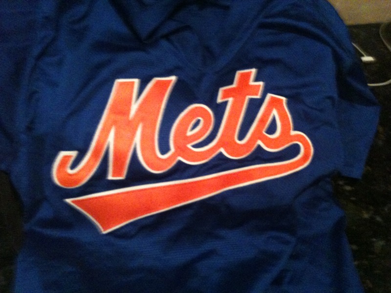
Since blue is all the rage this week – here’s a recent purchase I made.

A blue swoosh? It’s retro ironic!I had to buy it for kitsch. I’m actually enjoying wearing it.
I also realize I am becoming “the guy that always wears Mets stuff” around town. I wanted to wear Mets gear yesterday but instead I wore Star Wars. I love the Mets but don’t want to be “that guy.”
…
The next two scheduled posts are (a) fantastic and (b) from Ceetar who was out at Citi last night covering a blogger event.
I’d like to thank the Mets for inviting me to these events this season. I couldn’t make all of them but really appreciated everything they did this season.
I expect site traffic to drop off a cliff as it does every holiday weekend, but we’ll be posting at the normal schedule because we’re nutty.
…
Be sure to add Ceetar’s Optimisitc Mets Fan to your regular rounds.

Just love those Blue Met Uniforms…..Plus I think they are undefeated when wearing them!
Nah, 1-1 in Los Mets blue, 1-0 in BP jerseys with black caps
You know, that swoosh Mets script doesn’t look that bad. It looked terrible on the jersey; it’s when the M-e has to stretch across the placket that it looks all distorted and goofy. Look how much better the New York swoosh script looks, because of the natural break between the words.
[BTW, while searching for these images, I found another nice pic from 1998 of blue caps with the road gray dropshadow uni.]
They made changes in the letters when they added the swoosh…the cross on the T is shorter…the S is boxier…the M is squashed. When you are used to one script for 30 years, those changes make this one look off, even if you love the underline. I suppose if this were the original script for 30 years, the other script would look funny. But IMO, this one is amateurish in comparison.