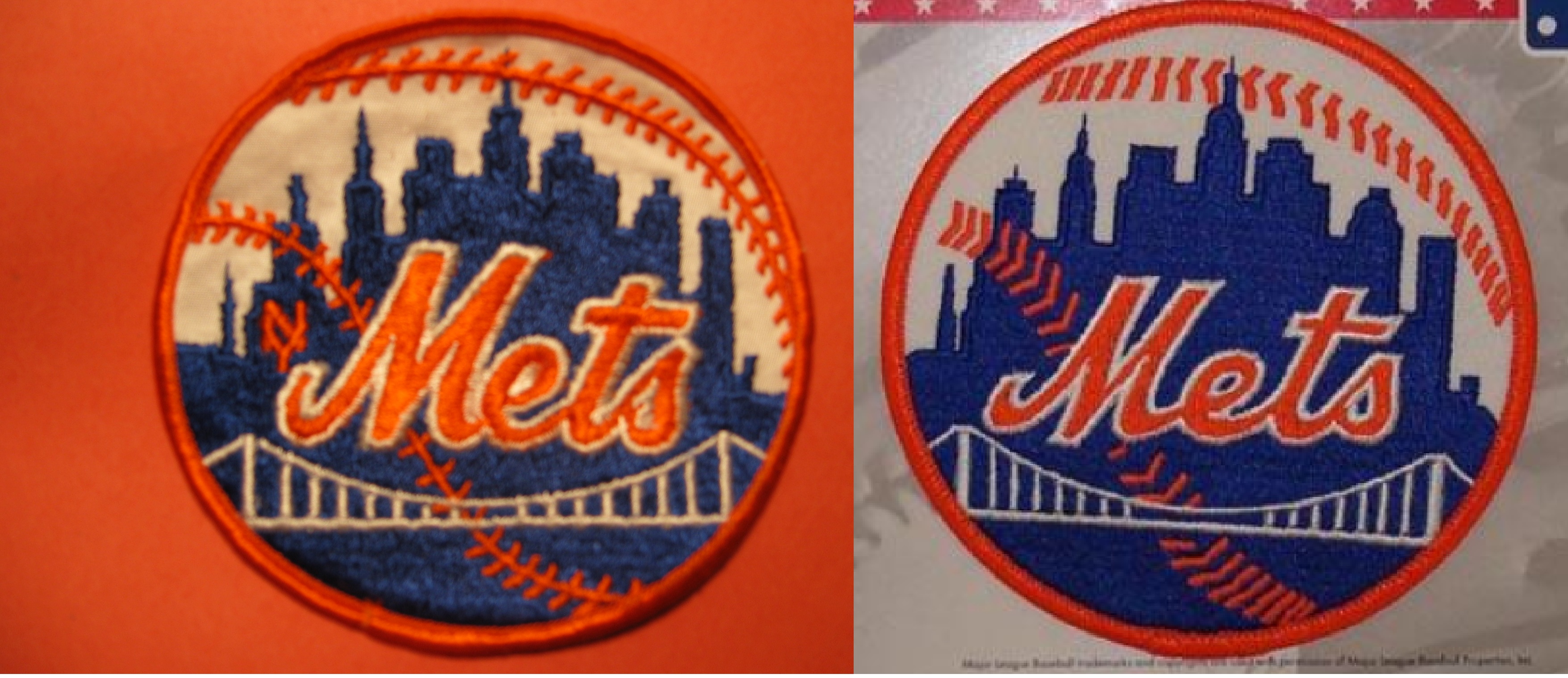
Steve says..
I just happen to own the original team issue Met patch from the 1960s or early 70s. People have been complaining about the current patch. Here is a side by side comparison. Enjoy. If I had the time, I’d do a whole history of how the patch has evolved into the mess that it is now.
Well, I am unfamiliar with the folks complaining about the current patch, but I enjoy the topic.
Aside from my usual comments about the NY, and Steve’s previous observations about the E, I never liked the incomplete baseball stitching. Why doesn’t it get to the end of the ball? I always think these are Chinese bootleg jerseys when I see them.


I think the patch looks better without the NY, but I wish they’d fix the stitching – you’re not the only one who thinks it makes a jersey look like a bootleg.
The NY works in larger, printed logos… not so much in tiny embroidery.
The second building from the left is supposed to represent the Williamsburgh Bank Building in Brooklyn. Over time, the fine detail on the right of that building has been filled in on print versions and sadly also on the patch.