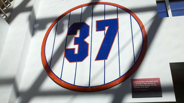
@koyote19: Retired 37 from Shea hanging in baseball HOF library
Very cool. Great story. Click and hit publish.
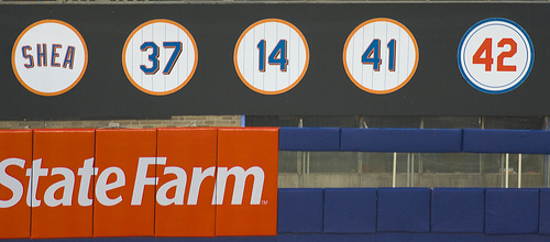
But that number font caught my eye. Here’s the fence from Shea.
So, what am I missing here? May have to call in General Lukas to solve this.


More than likely that’s just the original version of the number. The later version unfortunately used the black drop shadow which I never quite understood
They changed the retired number fonts/discs somewhere around 2003 or 2004. I can’t pinpoint the year, but I noticed it. That one from the HOF was probably on the wall pre-05’s. The image below is from 08 after they retired the Shea “name”.
Yup, the number at the HOF is an earlier version: http://farm1.static.flickr.com/202/460704464_38e958e5e2.jpg
That seems like the same font as what’s in the HOF library. My guess is 2006/07, you can see the Citi Field cranes and some early structure in the background of that pic.
Yep, that’s the original one. Here’s a link to the number hanging at Shea – http://www.flickr.com/photos/wallyg/460704464/sizes/o/in/photostream/
Looking through my old photos, they changed from the above odd font, to the below (correct) font for Opening Day in 2008 when they added the “Shea” disc. That number font (for 37, 14, 41 and 42) was there through the 2007 season.
you guys rule, great job fellas!