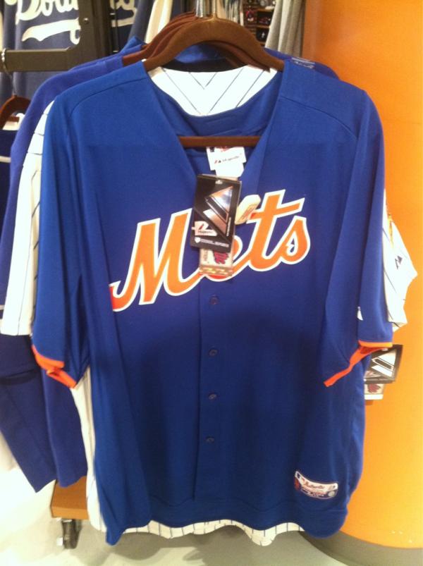
Media Goon found this at the Mets Team Store yesterday. We’re not quite sure what it is. It sure is interesting.
Some theories…
I’m not ready to make any declaration about this jersey other than it is blue and says Mets.
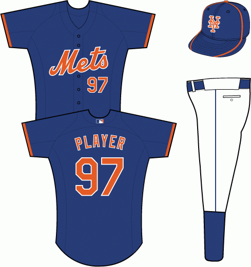
Updated: Goon here. Eric gave us a link to SPORTSLOGOS and there is a sketch of the Mets Blue BP Jersey.
Here is the sketch
I will let you guys make your own conclusions.


That would appear to be the Mets 2012 BP jersey
Its got the authentic tag at the bottom, most likely the new BP jersey mentioned at the press conference last week.
Seems to match this from SportsLogos.net
http://sportslogos.net/logo.php?id=rwp8mpt57fblsyqf4rejbd0rd
Thanks Eric. I posted the link and the sketch.
Looks like it’s probably the new BP jersey to me.
I think I want one of these more than a road jersey.
I now have a road, pinstripes and blue jersey. I really like all 3.
I’m really itchy to get a road custom. replica.
That’s the new bp jersey!!!. Don’t you read the Chris creamer boards?
It’s just one of those things that I don’t want to say that it is the BP jersey until we have official confirmation.
Agreed. We don’t actually know what it is so we don’t want to make a declaration. Hence the title of the post.
Aren’t the BP jerseys all from a common MLB template? This one looks very plain to me. I would put some more stripes on the sleeve and some striping around the collar.
No the jersey in person looks great. Your version of the jersey is a step back from the cleanness of the New Blue BP like jersey.
How is the orange sleeve stripe attached? Is it sewn over the blue…is it sewn under the blue and sticking out…is it a separate trim attached to the blue…or is it woven seamlessly into the fabric? Hard to tell from the pic.
All will be answered in a future post.
Here is a pic of the angels BP jersey. One color with a 50th patch on the sleeve.
Take off the orange stripe and it looks just like the 1995 era BP.
http://www.flickr.com/photos/66054817@N04/6405371071/
And what’s wrong with that? It’s blue not black and looks good?
Never said anything was wrong with it…big improvement over what they were wearing and has a link to the past. For my taste, I would add some more striping, but they may be bound by MLB design considerations. They will have more flexibility on a blue alternate.
It definitely looks good. The BP cap would look better without the orange stripe.
It’s definitely the 2012 Batting Practice jersey. I spoke with Paul Macchia, the retail manager at the Mets Team Store today. He confirmed that this is the BP jersey they’ll be wearing next season.
Really? It was funny yesterday at the Citi Field Team Store while I was there,someone asked if any of the new blue jerseys were out for next year and they said no, they won’t be available yet. Then I walked to the back of the store and found them. That’s cool that you got the confirmation on it.
Will the Mets still keep the hybrid hat?
Why does the new black uni have two patches?
Funny thing about the Mets is they can never just get things right. There’s a major FAIL embedded in the organization somewhere. I suspect there’s indifferent upper management that delegates to committees of incompetent lower management.
They announced in the press conference that he hybrid hat has been killed off
I hear it is a case of nepotism on steroids up top. But I do believe Sandy and Colactus are the right guys now.
Is there any word on how the sale went?
In terms of how much they sold?