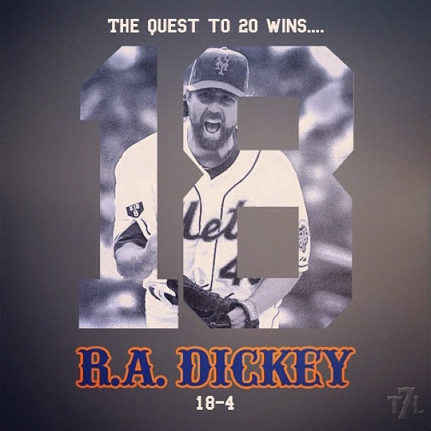
It was about a year ago that I called Darren from The 7 Line out for a sign he made and brought to Citi Field. I found it unnecessarily piling on.
Here we are a year later and I really have to applaud this guy. He has been positive and rallying and just a force for positiveness for the fanbase.
I saw this image on Facebook this morning.
Perfect.
A cool looking image that capture’s the mood of the fans.
I love everything about the image. Simple. Clean. Positive.
When the team markets it often has a feeling of trying too hard / just missing.
Look at the font Darren used. Now imagine an official Mets version. It would likely have that block print they’ve used the last few years. The “road font” Darren used is better.
I love the idea of T-shirt Tuesday but compare say the one with Mr. Met and the Phanatic to the simplicity of the well circulated Gary Carter 8 shirt with the tear.
This post isn’t to pile on the Mets (or MLB or MLBAM or whatever forces dictate marketing) but rather to cheer a guy I publicly called out.
Great job man. Really great job.


Thanks Shannon. I really appreciate it. I knew you and I would hit it off when we finally got the chance to meet down at Spring Training.
I know we didn’t always see eye to eye back then but feel that these days we have more of a common goal. Just be the best Mets fans we can be. That sounds cheesy, I know. I’m just trying to keep it fun. Thanks for noticing. LGM! Stay loyal!
what the mets should do is hire the guy. he clearly does it better than they do.