UPDATE 9:01am: I have some new information..I’m going to let the headline stand and keep the post below because I like the discussion in general.
It seems the Mets do have a new cap coming, but it’s not an on-field cap. Enjoy that mystery. More to come.
….
In today’s Uni Watch General Lukas wrote
There are lots of rumors floating around regarding next year’s Mets uniforms. What I’ve heard — and I phrase it that way because I don’t know for sure that it’s true, although I have reason to suspect that it is — is that they’re (a) adding at least one blue jersey, and maybe two, and (b) keeping the black jersey for Sunday night games. The only good part about that is that they now suck so bad that they won’t be scheduled for (m)any Sunday night games. As for rumors of a new cap, I haven’t heard anything about that, and I hope it isn’t true. …
More to come. And now, on to the original post which I won’t try to pretend never existed.
….
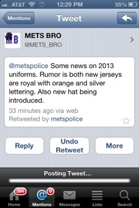
Mets Bro has tremendous street cred with the Mets Police. He was the guy who among other things had the 1989 throwback jersey story right and stuck to his guns even after it seemed like the story wasn’t true. So when he tweets the below, I take it seriously.
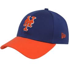
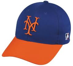
Given what we know about the uniforms so far I think it’s a reasonable assumption that we will see a new type of cap. This one will also have to be referred to as a “hybrid” but while the old hybrid was detested by many, this one may become reasonably popular.
I imagine the cap will look like something along these lines. I imagine the NY will be fatter than on the first, and won’t have the white outline on the second. This is total speculation on my part and I don’t know anything. I’m also not being coy like I sometimes do when I know something but can’t tell you.
Would you like to see the Mets in a cap like this?
….
Also as a follow-up to yesterday’s post. I speculated the blue jersey would have orange lettering. Note Mets Bto (he of the street cred) says both jerseys have silver lettering (I called it white. Yeah, I guess it is silver – my wife would agree I am color blind. I’m probably wearing one navy sock and one black sock now.)
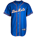
That suggests a home “Mets” and a road “N E W Y O R K” in the style of the 2012 Los Mets.
I much prefer the orange lettering from the 2011’s, but given some of the other horrible uni-decisions made since 1997 I wont be calling General Lukas to round up the troops over the silver letters.
Oh and support the fundraiser already. It’s five bucks.


Would love the first cap along with a twist on the NY
It’s a 5950 BP cap. All the teams are getting them. Players prefer the 5950s to the 3930s.
To each their own, but I can’t imagine why they’d prefer the 5950s. 3930s are infinitely more comfortable to me.
I don’t like the way the 3930s sit on your head. I like the true fitted wayy more than a flex fit. *shrug* flex fits always feel like they’re sliding down my head.
I STILL prefer the white/silver/cream/ivory/whatever lettering to the orange, at least for the home uni.
Hate that the black is sticking around, but “Sunday nights” is a reasonable schedule for it.