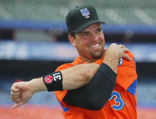
So far in Spring Training (TV games at least) we’ve seen the Mets wear the sno-whites.
Some folks are surprised they aren’t wearing the snazzy blues. The blues wouldn’t offend me in spring training, but wearing the whites suggests to me they are finally taking this whole uniform thing seriously. All hail Kevin Kierst.
Since Kevin took over as equipment manager the Mets have been dressing a whole lot better. The pinstripes returned “for reals” and in 2012 were the primary. I haven’t heard any such declaration for 2013 but I will hope/assume the pins still are. The snos became the alt in 2012. It’s a jersey that has grown on me over time, and actually looks better on civilians at the mall than pinstripes do.
But the Mets are not civilians at the mall, they are a baseball team. A hybrid cap might look good on my 9 year old but it looks terrible on Daniel Murphy.
This spring, the Mets are choosing to look like a baseball team. Nice crisp white uniforms. They can roll out the dress pinstripes on Opening Day (tickets start at just $39! – see Mets, I can play nice.) and have fun with blues as they see fit. And then jinx the whole season on John Franco Bobblehead Day with the you know whats.
The best part of the nice dressing…they weren’t even nagged by a not-as-fat-as-he-was* blogger. They did this all on their own.
By the way..if you really want to know why All Hail Kevin Kierst, read the greatest Uni Watch of all time: How the Mets got Black Uniforms.
…
On a side note, maybe I was just tired, but the NY on the caps was looking thin to me on TV on Monday night. Did anyone else notice that? Am I nuts?
…
*: comfortably fitting into a L David Wright jersey as I type this. Those XLs are swimming on me.


I always liked teams wearing the spring training/batting practice jerseys for spring exhibition games. It made all the uniform numbers in the 60s, 70s and 80s a little more tolerable and I guess I liked the gradual lead-in to the season feel they conveyed. However, now that spring/BP jerseys are a marketing item — changed every few years, with every team basically using the same template — I’m not as married to their use as much. But I do think it’s weird when one team is in its regular unis and the other in spring/BP jerseys (or, like the Tigers, in regular unis with the spring/BP cap).
So that’s my two cents.
Am I the only one who thinks they should drop the white alt? There are too many uniforms. Pins for home greys for roads and blues once a week or so.(I know the blacks are technically an alternate but really those are just a special event uniform at this point)
We have some of the best uniforms in baseball I don’t think that should be diluted with two white(ish) uniforms. Plus the Mets have been a pinstripe team since day one.
They always wear white for home games in Spring training in recent years. Same as game jerseys in the season. I personally would like to see the blue BP uniform with the Mr. Met caps being worn right now for the spring!
I still think they should either (1) drop the whites, or (2) change the whites to off-white and make the pins fabric white. That would make the pins traditional and the non-pins a nice fauxback.