My fear for the day is that people are going to see the throwback jerseys today and decide they look cool. They are not cool. They are occassionally fun as a goof in the same way a Mercury Mets jersey is. If Osh41 would ever invite me over again (the last time he had me over he made me miss the Santana Gem in 2008 and that’s five years ago) I would wear a swoosh just to get a rise out of him.
Anyways, the fear is people will go “that looks cool” and tweet that and the Mets will mess up everything again.
SWOOSH IS BAD. DO NOT ENCOURAGE THE METS TO EVER BRING THIS BACK.
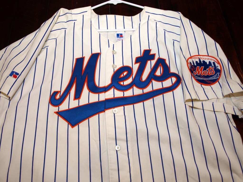
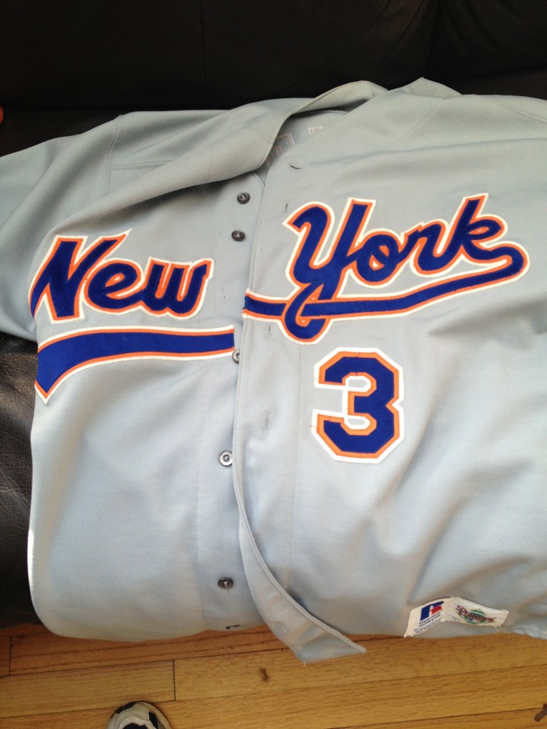
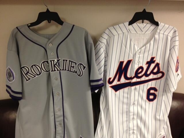
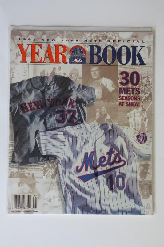
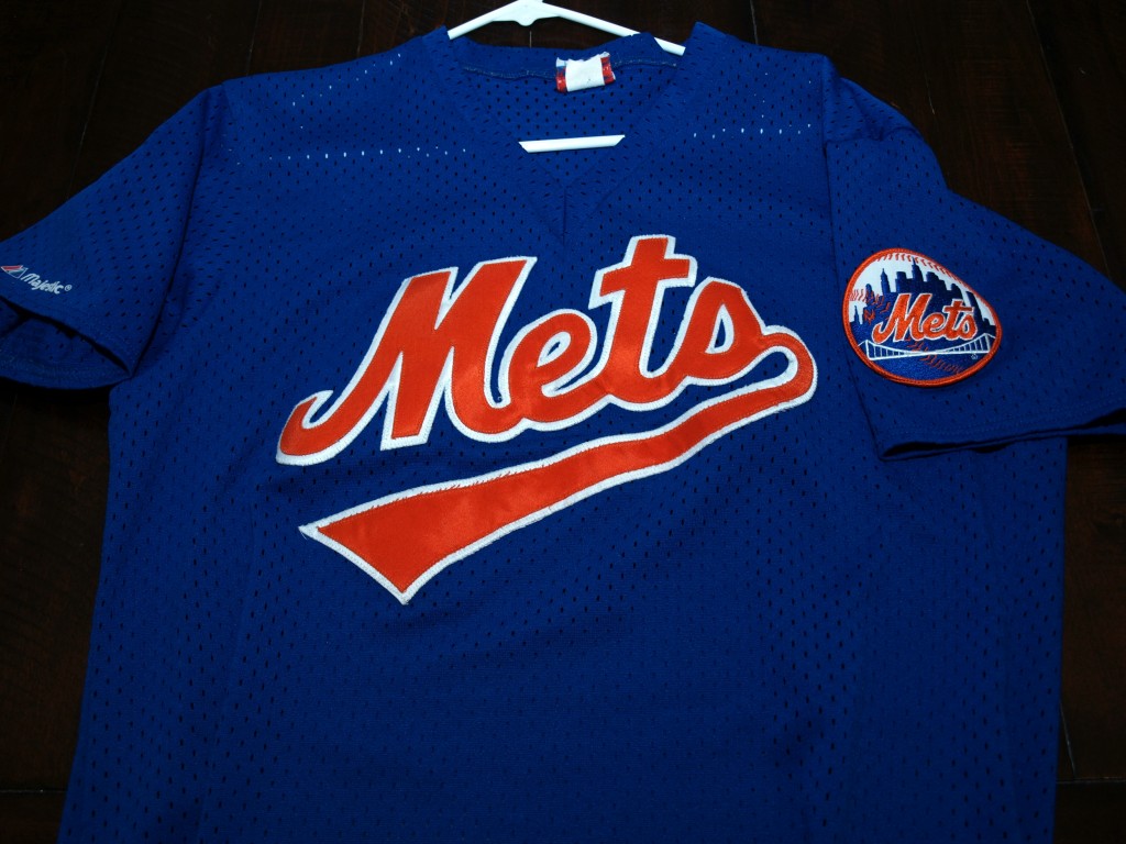
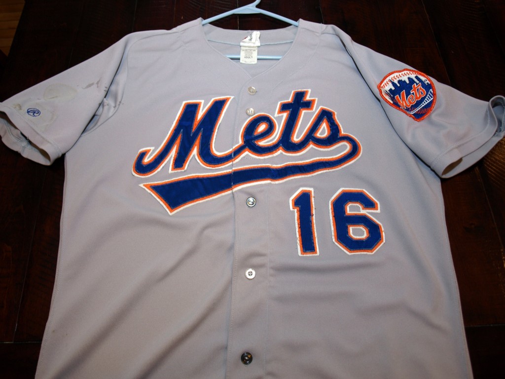
My understanding is everyone will wear 42 in the day game and swoosh it up at night. Someone tell @mediagoon he is on screengrab duty.
Agreed, althought the roads are not that bad, they cannot be compared to the current ones.
The Mets “swoosh” style was similar to the Montreal Expos “swoosh” style implemented from 1992 until their 2004 departure for Washington. I bet that the uniform change from the 1980s racing stripes to that was motivated by that originally.
I think the road swoosh is awesome. With some tweaking, the home one would look great too
Let it Snow…Let it Snow…Let it Snow and you won’t have to worry about it!
They might need to wear parkas instead.
The home jerseys were a complete “WTF?” but you can’t include the road jerseys in this. They were an upgrade over the basic block lettering that preceded them.
I’m going to have to knockoff-Photoshop one of those without the underline when I get a chance. As I’ve said before, THAT is the Mets font, as opposed to a Giants hand-me-down (not that there’s anything wrong with the latter).
The problem with the home swoosh jersey is that they distorted the M. If they just used the normal Mets script and added the swoosh below, it would not look so bad. The distorted M is what bothers me most about it.