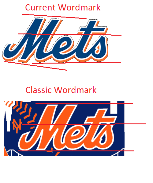
This is from 2010 and some of the issues have been cleaned up, but you really need to read the original article on Uni Watch and click on all the links to truly understand the horrible Wilpon Script, lopsided Ms, and the yucky tail on the M that appears on many late ’00s jerseys.
More recently, though — I haven’t been able to isolate exactly when, but I think it was in the late 1990s — the Mets created a wider, more extended version of the script. This has been the team’s official wordmark at least since 1999, and I believe for a few years before that. If you can’t see the difference between this mark and the one that originally appeared on the jersey, try this comparison. The angle of the M has been altered, and the connection from the M to the e has been adjusted and lengthened a bit. This is script is essentially what’s been used on the team’s uniform for the past decade or so, as you can see in the jerseys shown on the right. Look at that M — horrific. I hate this verion. Looks clown-ish, like a minor league knockoff. Let’s call this the Wilpon Script.