Hi. You are probably coming here off a link from Uni Watch which means you like Uni Watch and the Mets…so I would be a fool if I didn’t tell you about the Queens Baseball Convention which is January 10th. It’s Fan Fest meets Comic Con. Mookie Wilson, Wally Backman, Ed Charles, and lots of panels including one about uniforms hosted by Paul Lukas. Check out the details here, and I hope you can come. And wear a nice jersey to the Jersey Parade.
…
I was sitting in the office at MPHQ making a call and my eyes went to my vintage 1986 Pennant (dirt/rust and all) and my eyes locked in on the S.
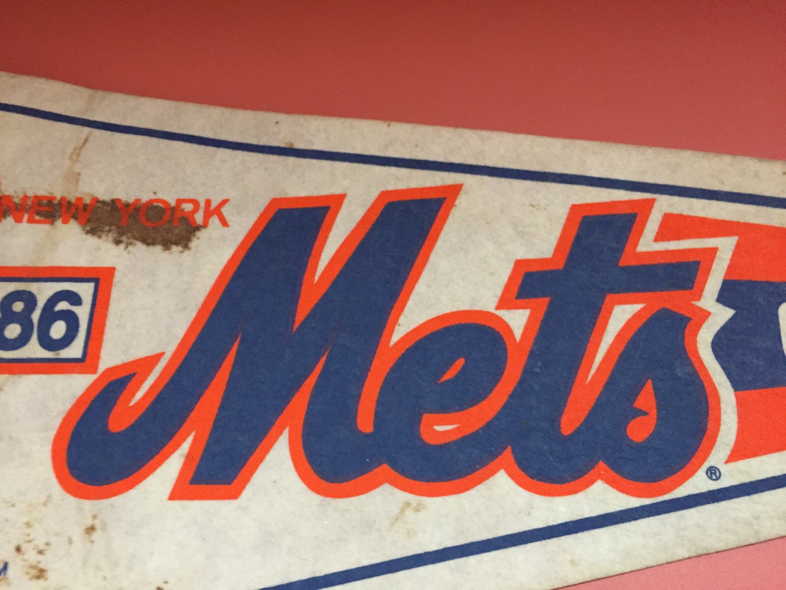
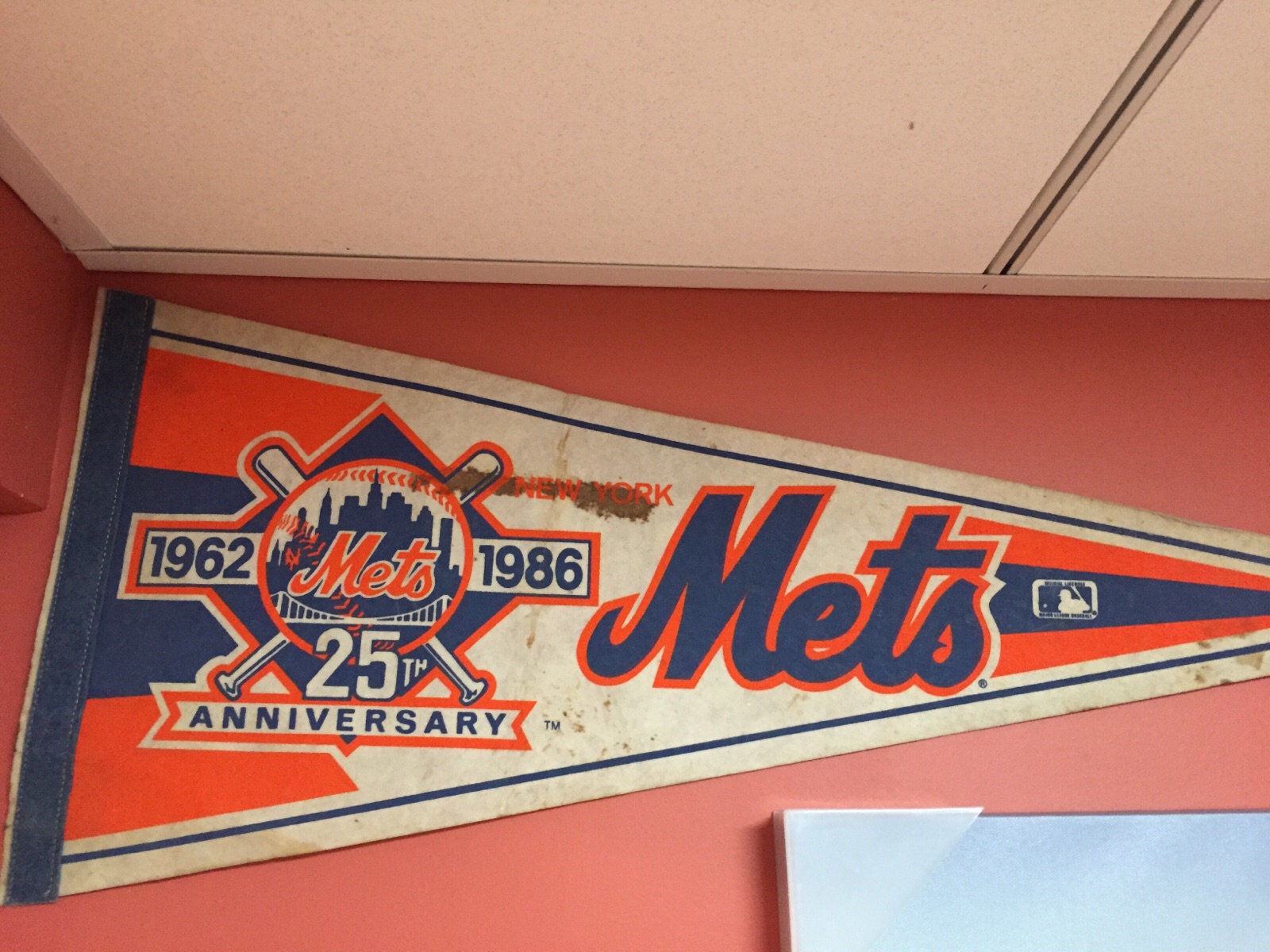
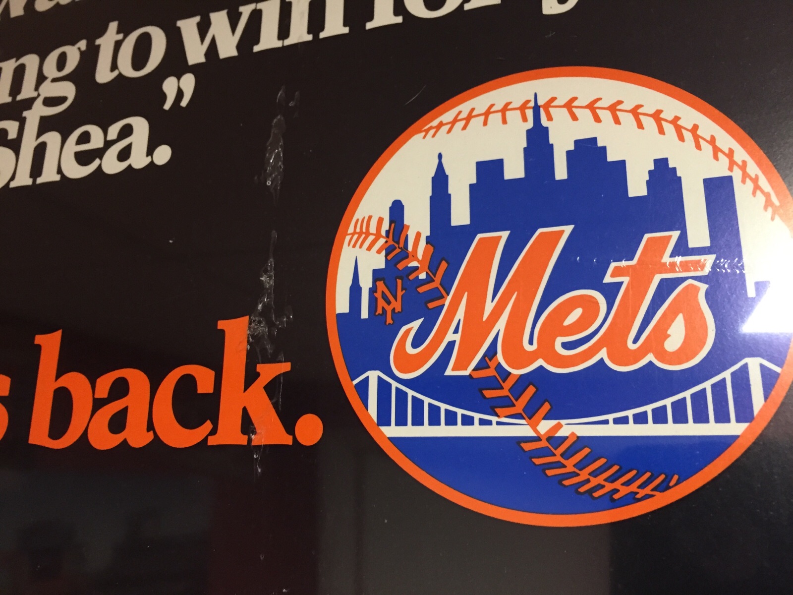
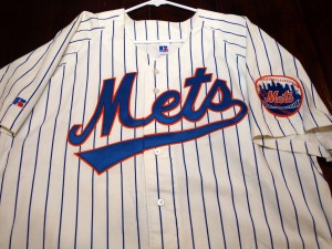

Here on the black logo the S is the way I would have drawn it from memory (well, without black of course.) That’s why the extra curl caught my eye.

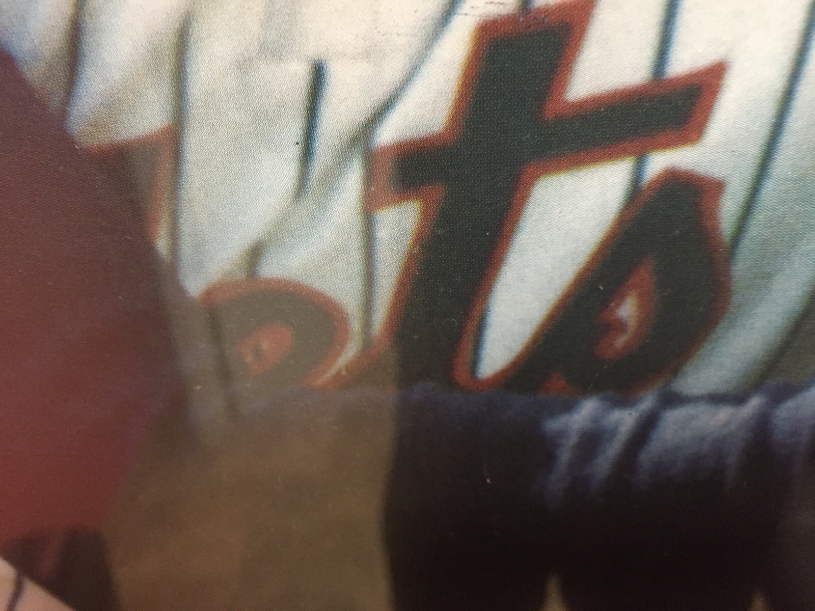
I had to zoom this image up but it looks like 1962 did have the curl
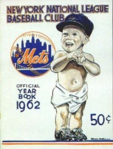
Anyway, I could go on and on. It appears to just be another one of those that is different depending on what you’re looking at. Sometimes the M hooks into the e, sometimes the loop of the e is higher. Sometimes the t is elongated. Sometimes the M has a long tail. And I guess sometimes the s has an extra curl.
It’s not a “thing.” I am not demanding action. I just thought it was interesting that it took me nearly a half century to notice so I thought I’d share.
(Paul, if you’re reading feel encouraged to do the proper version of this hack-job post)
