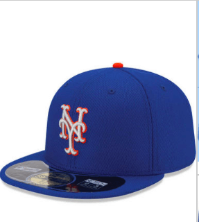
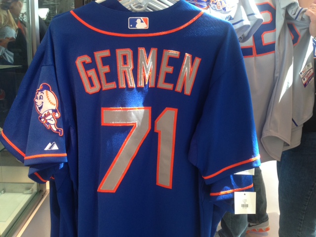
There is something about the road caps that doesn’t quite look right to me. The lettering looks lighter than that of the jerseys.
Last night on twitter I asked Paul Lukas of Uni Watch for a “ruling”
@metspolice I think they’re the same…. or at least veryveryvery close.
— Paul Lukas (@UniWatch) July 21, 2015
And with that I was done. However….
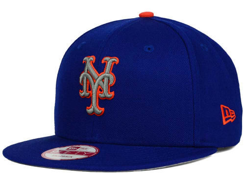
This morning I am looking for “filler” to cover the blog during an upcoming road trip and found this cap.

This is called a “two tone Link 9Fifty” and see how the orange is bolder. Below is the normal road cap.

To my eye, the cap up top looks more like the lettering on the road jersey.

Perhaps the cap up top would work better?
