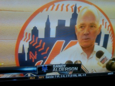
Trivia time – what’s “wrong” with this Mets logo. I must admit I didn’t catch it myself. Answer below.
@metspolice Im at disney all star sports. Ive never seen a ny like this in the old mets logo… a disney mistake? pic.twitter.com/3XxYjLuKPk
— Nicholas Schiavo (@nickschiavo) March 19, 2016
(insert Jeopardy theme)
Time’s up. Look at the NY. Usually on the ball logo the NY is more of a stick figure NY without the flourishes on the traditional NYG/NYM NY. Of course the modern Mets don’t use the NY at all for some reason that doesn’t make sense to me (something about it being hard to reproduce, although they were able to produce it in the 70’s with worse technology, and Darren can somehow put it on t-shirts, but I digress.).
And even more mystery, there it is in the Sandy Alderson era…so sometimes it can be reproduced. Very confusing.
