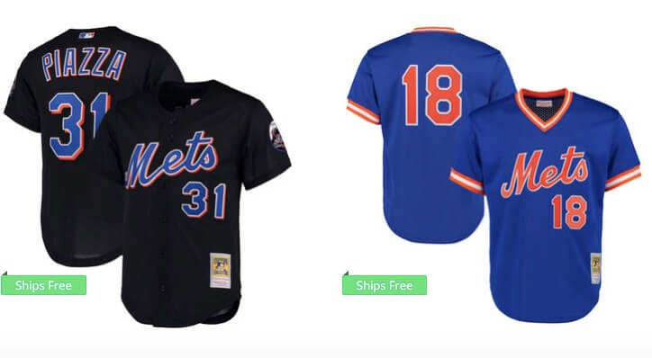
There was a while earlier this century where the M on Mets jerseys had this awful awful long tail. It went away when they fixed the uniform set in 2012.
I didn’t wake up this morning looking to rant about this, but I got my daily email from MLB Shop (anyone else stalked by MLB, yes of course you are, we all are) so I clicked on it and I saw this

Now for today’s discussion I don’t want to get into colors or any of that. Just look at the M into the e on the Piazza jersey. Now look at the Strawberry M e. Now look back at Piazza.
You cannot unsee it. It is AWFUL. And thats how jerseys looked for a while.
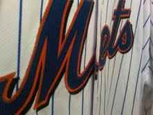

YUCK!