As we celebrate the 10th Anniversary of the Mets Police, I am revisiting some unfinished posts that are sitting in “Unscheduled Drafts.” Think of this as outtakes from a box set. Blogthology if you will.
This one was started on March 23rd 2017
……
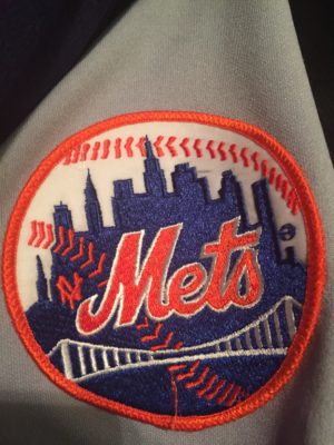
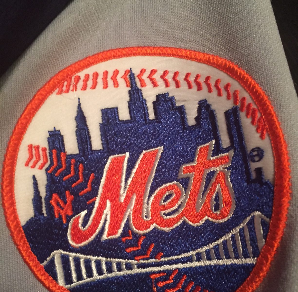
I was just poking around my closet and this caught my eye.

I like the NY
…..
and that’s as far as I got that day.
Well, finishing the thought, I’ve heard various things about it being hard to reproduce. That doesn’t make sense to me since they knew how to do it in 1962 and now we have computers and TECHNOLOGY STUFF.
Another argument is the NY doesn’t match the Mets borrowed-from-the-Giants NY.
SIDEBAR – it’s 1962. You’re a former Dodgers fan. Doesn’t it bother you that that the cap and road jerseys borrowed heavily from the Giants? I know it’s blue and all, but seems kinda Giantsy, and the team plays in the Polo Grounds. This is a generational injustice that we will have to fix some day even if it takes half a century to make it clear that the Mets are the sons of the Brooklyn Dodgers!
I digress…..
Anyway I like the NY. The ball seems incomplete without it. What say you Mets fans?

