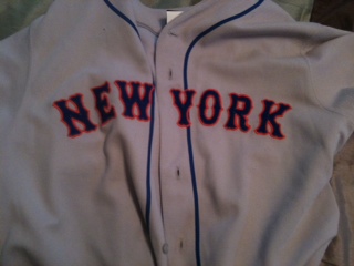
A look at the Mets’ letter N

Saw this…

Look at the N.   Interesting N isn’t it?

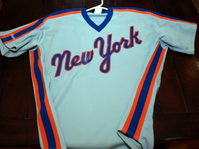
It’s not like this 1987 N….

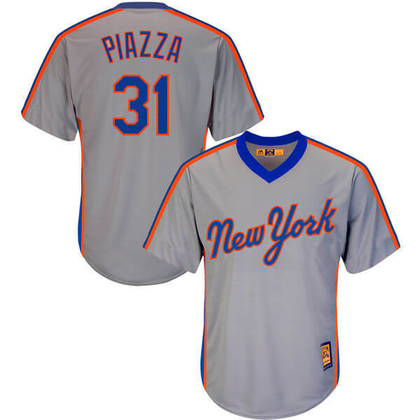
But it is kind of like this Swoosh Era N…..(And i prefer this N to the above N)

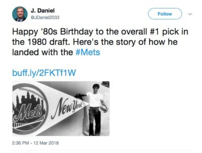
Or should a Mets N look like this?

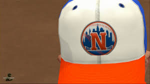
Or I guess it could look like this

Or it should probably always look like this.

The Mets Police
Privacy Overview

This website uses cookies so that we can provide you with the best user experience possible. Cookie information is stored in your browser and performs functions such as recognising you when you return to our website and helping our team to understand which sections of the website you find most interesting and useful.