So, as I said in the caps post earlier, these are uninspired…but I guess they could be much more trainwrecky, and we’ve had some bad Spring designs over the years.
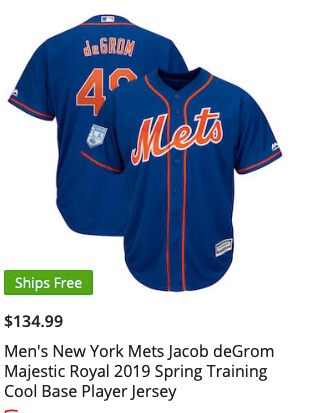
Let’s start with the 2019s…which are on sale now, and capitalistic bloggers encourage you to buy ten jerseys and 15 caps!

So that’s kind of uninspiring. Also $134.99 is kinda crazy town.. I mean, only $135!! You should buy ten!
The good news is that Fanatics stopped with the insanity that was the white numbers that looked like (bleep). Here’s the 2018 as a reminder..

TERRIBLE. So good job fixing that mistake.
It’s always interesting to me to see who the marketers think are the star players – this year it’s Syndergaard, deGrom and Conforto. No Cano. VERY interesting. (Maybe Andy Martino has a theory).
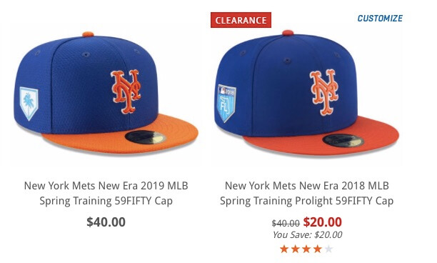
To save you a click. here is the 2019 cap, and then the 2019 side by side with the 2018. Note the thinner whiteshadow.


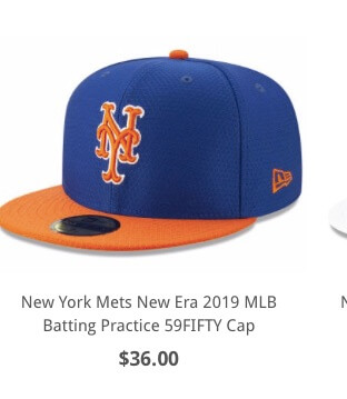
Also just in, are the 2019 BP Caps….looks familiar…

To me that looks more like the 2018 Spring than the 2019 version….but who knows, could be model differences, photoshop inconsistency etc…let’s not dwell here.
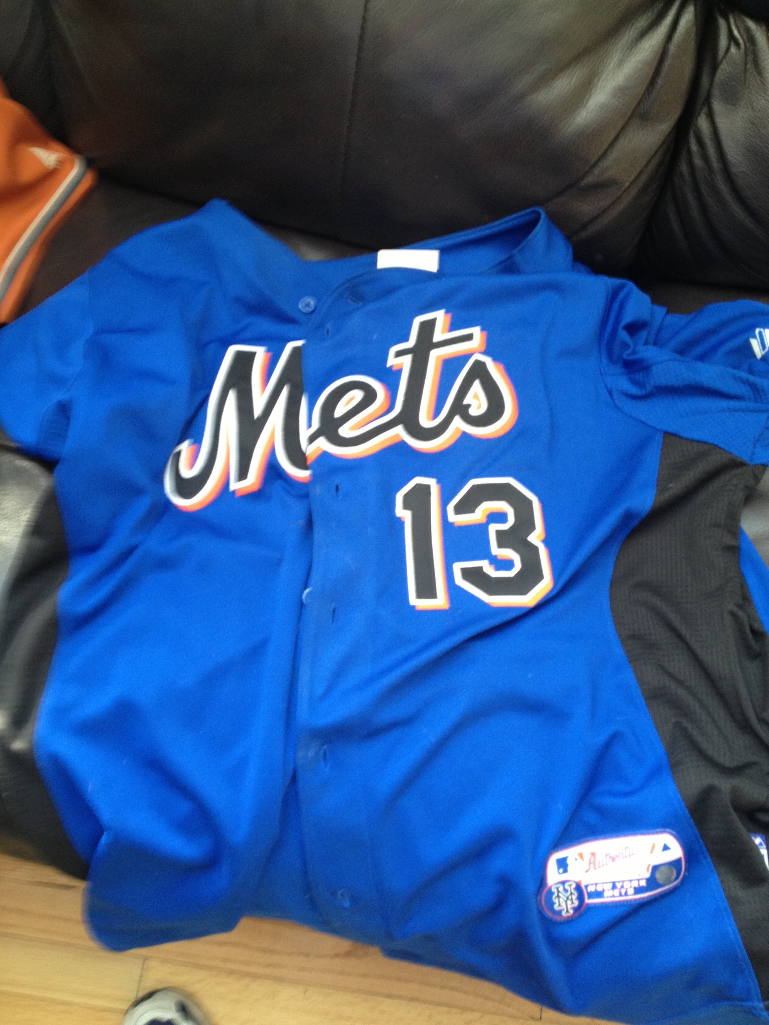
Looking backward through time…remember these from 2012?

At the time I was so excited because they were blue. Then I went through a phase where I didn’t like it because of the black. I like it again – although remember side panels…look more closely…your eye might make you think its just a blue jersey (which would look cool) but this has black side panels.
Anyway, I think there’s some design potential in there.
Finally, for once I got this right. I held the blog back (open, meaning didn’t pre-post) hoping these would come out today. The worst thing as a blogger is pre-scheduling a post that gets wasted 5 seconds later because the Mets drop a bomb. When I’m around it’s easier to manage, but on days where I pre-load (tomorrow being an example) it’s frustrating. (Oh yeah, today is truck day too.)
Speaking of tomorrow, I will have a major statement involving BLACK jerseys.