Stop everything and go read Uni Watch’s deep dive into this…
Paul has the book and walks us through what’s inside. It’s the most exciting post I have read on any site in a long time….definitely all of 2020.
There’s so much to read in that post including this which I won’t spoil…
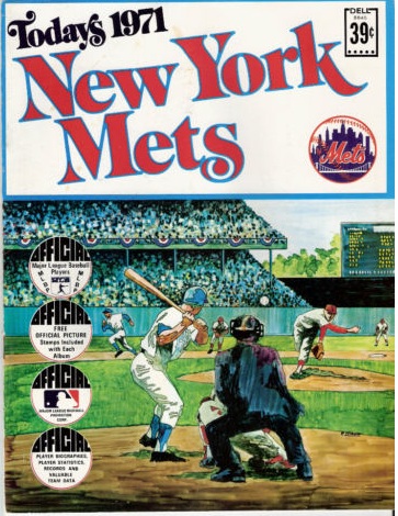
I didn’t notice this at the time, but look at that “NY” logo — it’s all wrong! All of the flared serifs on the “N” are improperly oriented except for the ones at lower-left, and the “Y” isn’t quite right either. I don’t recall if I noticed this when I was a kid, but I’m stunned by it now. Why would they use such a crummy knockoff logo on a licensed product?
Don’t you wanna see the crappy NY? Of course you do! Go look!