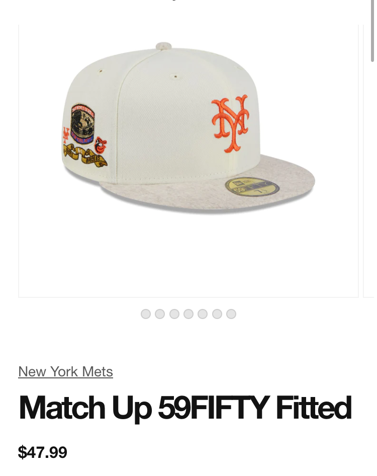
The orange looks so boring. This would look better with a blue NY, and probably even better with a layered NY with the blue and orange. layered (see bottom for an example)
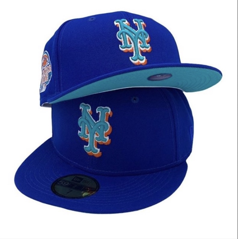
The aforementioned layered look
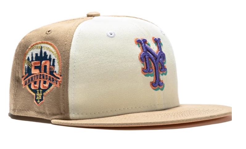
Then again maybe it wouldn’t
What Mets fans talk about when not talking about the actual games.
The orange looks so boring. This would look better with a blue NY, and probably even better with a layered NY with the blue and orange. layered (see bottom for an example)
The aforementioned layered look
Then again maybe it wouldn’t