Paul Lukas on Uni Watch explains that MLB and Nike now have standard number fonts. The net result (to me)….(and thanks to Lauren for pointing it out) – the numbers look like the garbage you’d find on Chinese knockoffs.

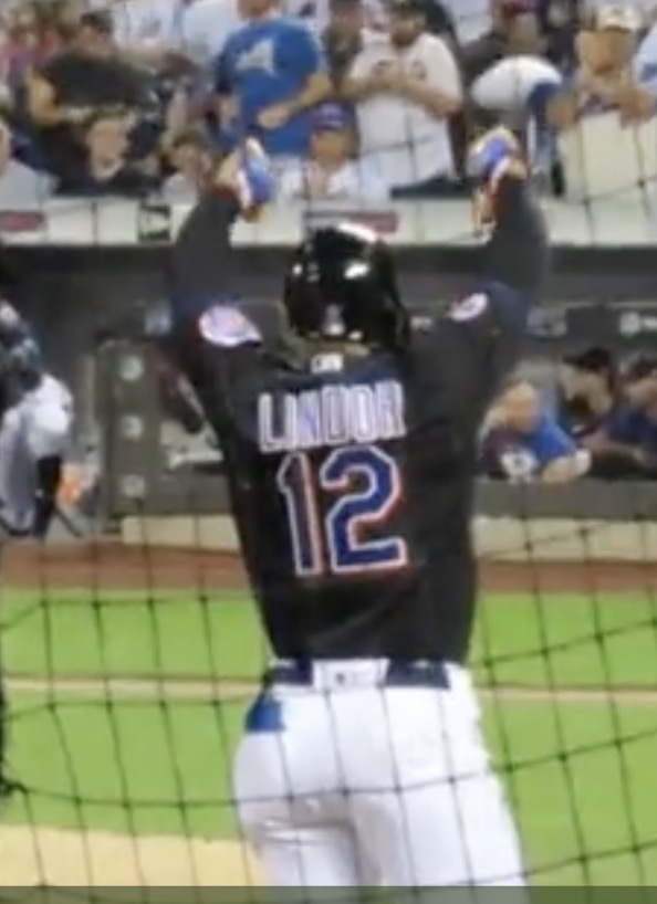
Compare that skinny 12 to how it used to look. Clearly the below is better.
Paul also discussed the way the team names split across the buttons. Looks like we’re returning to the ugly long tail M.
Anyway, baseball is dying no matter how much The Baseball Mafia says otherwise. Nobody cares. Whatever you wanna wear is fine.