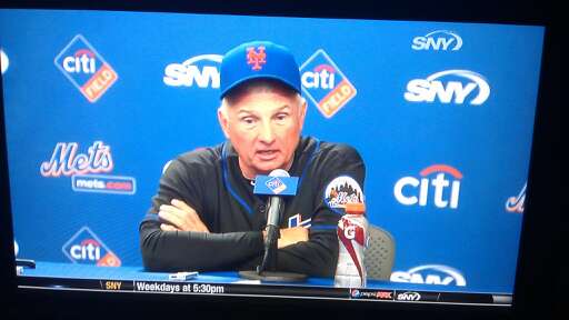
I forget when this is from (Sunday?) and I forget who sent it (my apologies on that) but most importantly..
…what the hell. If they are going to mismatch and wear random combos why not this one?
What Mets fans talk about when not talking about the actual games.

I forget when this is from (Sunday?) and I forget who sent it (my apologies on that) but most importantly..
…what the hell. If they are going to mismatch and wear random combos why not this one?
Comments are closed.
That pic is from the Sundays post-game news conference. My immediate guess is an old Mets get-away game tradition left him without a black hat, and he just grabbed what was available instead of going without. Likely the situation was further caused by the 8PM start time of the game on a get-away day.
The Mets used to have a tradition of dropping off their game worn caps, in a bin, as they exited the field on get-away days, to be taken on the road with them.
Last year, the Mets wore hybrids in all but two get-away games. They wore full black caps for the game prior to the All-Star, and during the last game of July, which began a stretch of the six straight games in “BLACK” (1 home get-away, 5 road)
the Mets have not been consistent in get-away game attire this year.
I saw this the other night and immediately thought of metspolice… unfortunately I didn’t have a camera ready (nor DVR). Glad someone caught this!
This is the 2nd time I’ve actually saw him wear this combo. The first time @ Citi field in his office before a Marlins game if I remember correctly.
They actually wore that for one game in ’98. It was a night game at home, I believe in August, possibly late July.
I seem to recall it from the second game of a doubleheader against Colorado that August (8/18/98). It was jarring then. It’s jarring now. Props, though, to TC for feeling it necessary to wear a team cap when addressing the media.
I wonder if there’s a picture anywhere on the interwebs?
I’ve been searching since that was posted on UniWatch. Can’t seem to find anything. For some reason a picture of Bobby J Jones in this odd uni combo the second game of a DH in 98 is burned into my memory. It would’ve been 8/18/98, nightcap vs Rockies.
Screengrab was mine. I knew General Shannon and Supreme Commander Lukas would have a conniption when they saw it! I still think The Media Goon has some hand in it…
dam if they win they can bring back the 1970’s White Sox jerseys just win who cares if you win what you look like lol
hmmm…didn’t realize you guys were doing this over here
last evening (well, two days ago by the time anyone reads this) i searched all 60 pages of getty images searching for that particular combo for the Uni Watch board — and NEVER found it
does that mean it was never worn? of course not…but using the boolean terms of “1998 + mets” i figured would be the best place to start
lots of black tops with hybrid caps, and a whole bunch with that and blue sleeves (a rather odd combo, but one that i think is better than the all black)…but nothing with a solid blue cap
if anyone can find such a beast, please drop me a line at phil.hecken (at) gmail (dot) com — we’ll be sure to feature it over on UW as well
Umm..Phil…
I must bring this tweet reply to your attention… http://j.mp/je4Owb
I told you so…LOL
im talking about blue and royal on the jersey, but whatever — i prefer contrasting sleeves (of course, if you have white or gray jerseys, the sleeves are ALWAYS contrasting) — the solution is simple — ditch the black
fuck…i mean BLACK and royal
and i just read the “pretweet” where you were in fact, talking about the jerseys with the undersleeves — my bad, i was thinking you were talking about the royal and black on the jerseys — which looks like garbage
unlike many on here, i prefer the hybrid cap to the all black one, and the hybrid with black sleeves to the all black look (talking about home unis) — but i hate them all — just different degrees of hate…the main reason i hate the black jersey is it appears to simply to be a mirror image of the white one — in other words, little or no thought was put into actually making a black jersey — just a “lets swap out the white for the black” type of deal — the ONLY difference between the two is the black jersey has a white outline around the “Mets” whereas the white has a black outline — but other than that, the script is royal blue, the headspoon is royal blue, the sleeve piping is royal blue, and the dropshadow is orange on both
i still hate the black jersey with royal sleeves — because black and royal DON’T look good together — but it’s better, or only slightly less worse (is that english?) than the all black
mea culpa for misreading your first tweet…no excuse, but i wanted to clarify
again…the way to fix all these problems is simply to ditch the black