Mets Uni Patches for 2012 (My designs)

Hey everybody. I was having issues with my photoshop and I could not do a lot of the stuff I have done in the past with graphics. I am not going to lie, it drove me nuts.

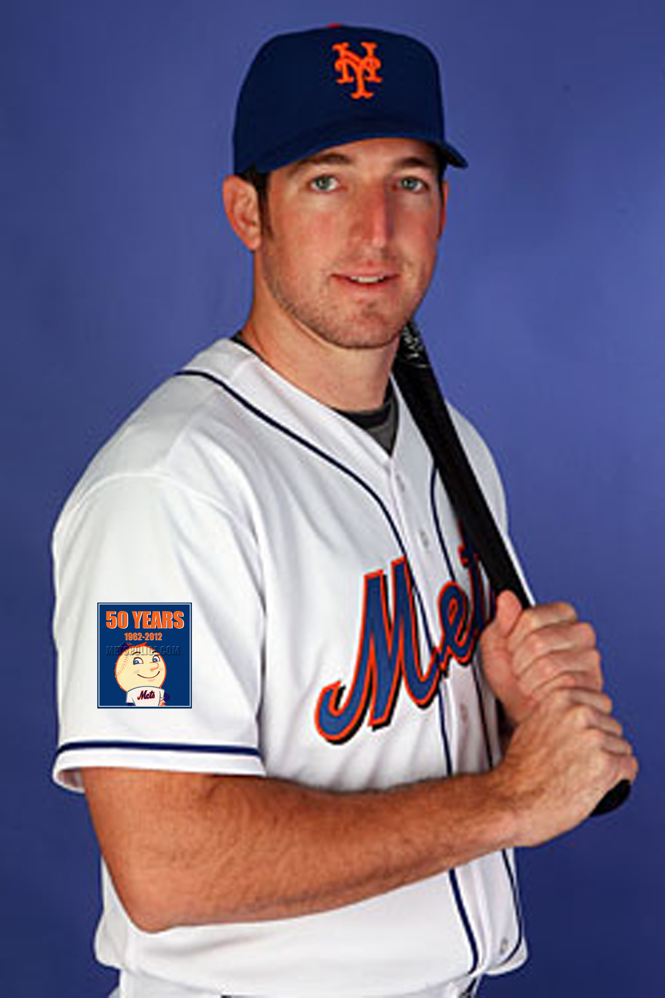
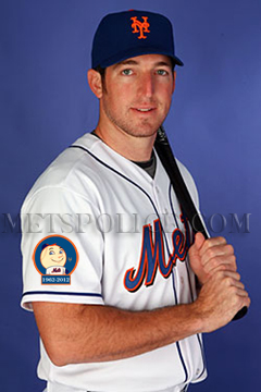
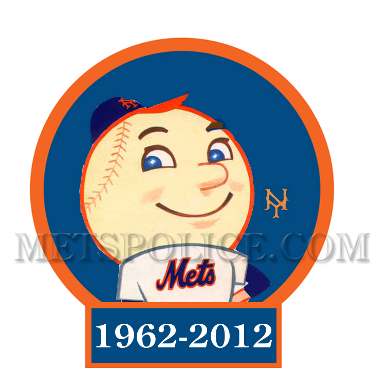
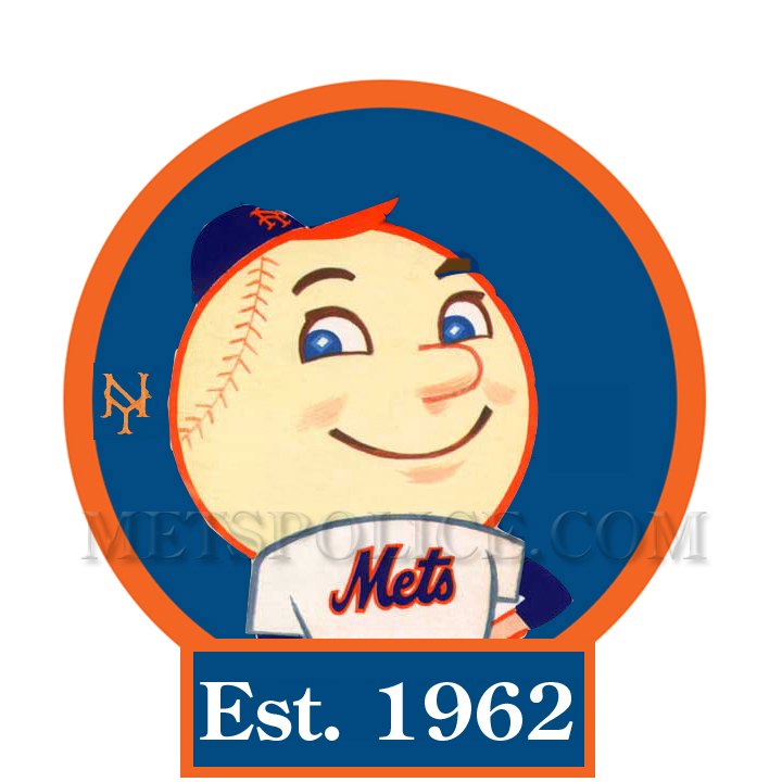
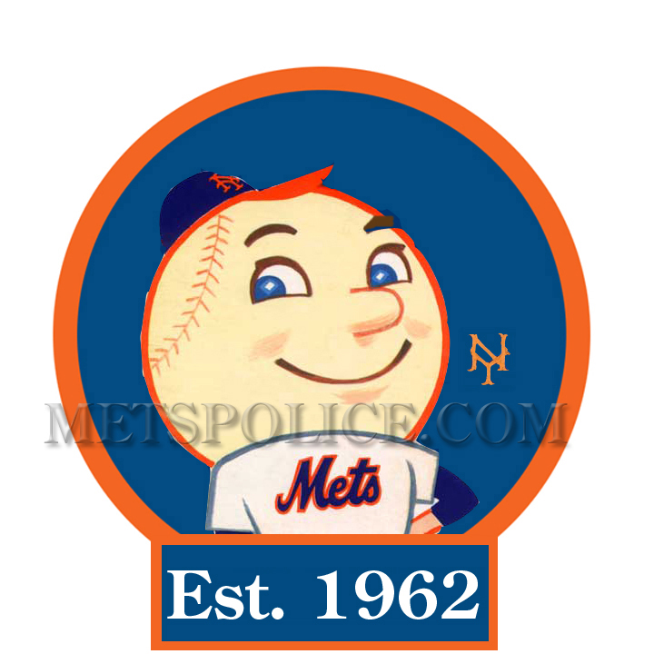
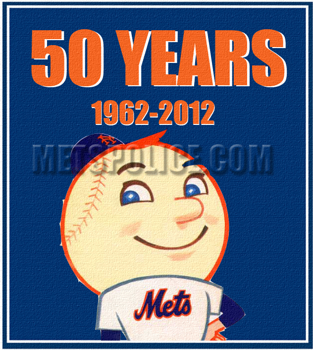
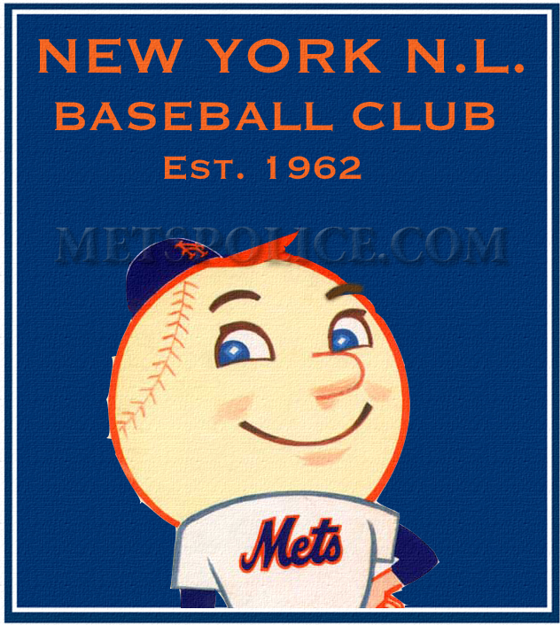
I know there has been discussions about the looks of the uniforms next year and possible patches the Mets might use. I played around with a couple of different looks. More Patches after the jump. Which one do you like?  Hate them all? (Click on for bigger images)

9 Replies to “Mets Uni Patches for 2012 (My designs)”

  1. Meh. I don’t know if I like having Mr. Met’s giant off-white head be the patch’s most prominent element. Still, all of these are better than the Domino’s Pizza patch from 2009.

    Which reminds me: I did vow to buy a dropshadowless road gray, if indeed it comes to pass, but I may have to wait until 2013 to get one without the 50th Anniversary patch, regardless of what it looks like.

    1. Don’t be so fast to avoid the 50th patch…they could win it all and the patch will be a part of it like the 1986 patch.

      Did I really just say that?

  2. It would make a nice t-shirt…don’t know about being a uniform patch though. You don’t want a large headed guy with large foam hands to try to inspire fear in your opponent.

    DISCLOSURE: I have my own patch design out there.

  3. I really like the rounded, Mr. Met patches. The “NY” is a little unnecessary, since it is also on Mr. Met’s cap. I’m not sure which I like better. “Est. 1962” looks cooler, but doesn’t establish the anniversary. “1962-2012” seems to suggest Mr. Met will die next year. They both look great.

    Maybe there’s a way to work in the 50th anniversary without using the tombstone inscription or the words “50 years”. Placing “Est. 1962” across a gold banner instead of a blue one would acknowledge 50 years in a more subtle manner.

  4. Yeah, I agree that the 1962-2012 sounds like an epitaph. The way things are going with this team, it might be!

    However, LOVE the olde tyme Mr. Met with the “Est. 1962.”

  5. I don’t know, the image used kind of reminds me of that weird Mr. Met, that was used for like a season.

  6. Mr. Met always made his own fashion statements…he wore snow whites decades before the Mets…and he wore an orange brimmed hat. Today he wears his name straight on the back and the rest of the team uses arched names. He seems a bit off at times.

Comments are closed.