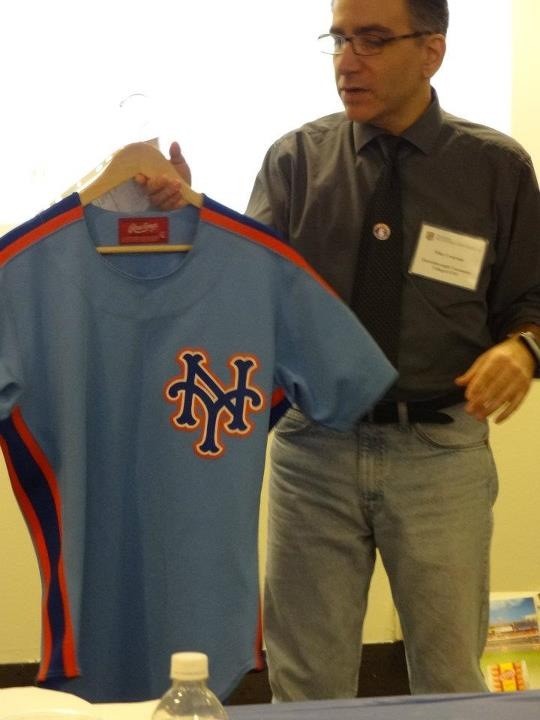
I bet several of you will point me in the right direction, but for me right now this is a mystery.
Yesterday this showed up on twitter…
Again, with fear that all the answers are on the internet already, here’s what I “know” and think –
This was shown at Hofstra over the weekend.
Someone mentioned there was a panel I would have loved and this showed up at it. It is an “80’s protoype.”
I don’t remember this from my childhood. The powder blue suggests early 80s as opposed to late 80s…but that’s just a guess. The Mets did spend most of the 80’s tweaking the road uniform (it was an annual spring training curiosity – what will they wear?).
I don’t recall this at all, not even being floated as possible.
I have an email out to Supreme Commander Lukas from Uni Watch. I bet he knows the deal.
So…do you like it? Would you buy one? Should they have worn them?
My answers: no, yes in a heartbeat, no.
—-
Update: the above I wrote last night. This morning I woke up to this email from Remembering Shea. I haven’t even had the chance to go through it and/or click the links but I wanted to share.
Good to finally meet you on Saturday. Since I saw that you are going to use my picture of that powder blue late 1980s Mets jersey proposal on your site tomorrow, I felt that I should give a little context…
The person in the photo is Mike Cesarano from Queensborough Community College and CUNY presenting “The History and Evolution of the Mets Uniform and Logo Design” from Thursday afternoon’s panel “’Metsmobilia’ and Mascots”. I don’t remember much about this jersey other than it was a uniform proposal that didn’t make the cut. The larger presentation looked at different uniforms, a little bit on uniform patches, and included a few very old game worn uniforms as well as some replicas. We didn’t see everything on this rack (http://www.flickr.com/photos/78174371@N03/7126306311/in/set-72157629564386124) during the presentation. There was also some discussion on the Mets “baseball” logo, including the Williamsburg Savings Bank’s evolution (seen at http://www.flickr.com/photos/78174371@N03/7126308197/in/set-72157629564386124) if you wanted a future discussion (seems like something you might do). A few other pictures from that panel, which I think you would have really liked, are on my flickr set (http://www.flickr.com/photos/78174371@N03/sets/72157629564386124/with/7126316779/), from discussions on Mets mascots and marketing the Mets.
Jason (a.k.a. DyHrdMET)
http://RememberingShea.blogspot.com
www.facebook.com/RememberingShea
Jason thank you thank you! I will be diving in as life allows.
