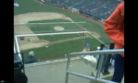
As I frequently mention, I enjoy the back and forth between the various Mets blogs. The other day the guys over at Remembering Shea brought up some suggestions about how to fix some of the issues with Citi Field. I had a busy week and never got to properly respond.
- The plexiglass has to go. Shea had railings in front of the first row of seats and boxes in each level. They were thin, and you could grab your hand around them. They were also painted the same color as the other hand-rails and seats in that level, so you hardly noticed them. They could have done the same thing here. I don’t see what type of extra safety the plexiglass provides. I’d love for a photo from the first row in the Upper Deck at Shea to compare to though.
I don’t think that will do the trick. The problem is more than the plexiglass, it is the design of the landings. You would still have some sort of railing/something there, and you’re still going to have people there.
I have spent a fair amount of time thinking about it, and the best (and not very good) suggestion I have it for the Mets to remove the first three aisles in every Promenade section and just have the landing attach to walkways, so that people can quickly get out of your way (think of the old Mezzanine at Shea) and tomorrow I’ll show you an example (from Yankee Stadium) how it might look.
 2. The LED ribbon. At Shea, the LED ribbons were installed 40 years after the park was built. They went on a facade that was actually tall enough to have the ribbons block the face of the facade instead of any views. Citi Field was built with fairly small facades. And they knew there would be LED ribbons there from the start (how could they not?). It doesn’t look like an issue in this photo
I haven’t sat in any of these seats. I’m guessing that the issue is that you need to lean foreward to see over the LED. That’s a sloppy design, and while it will cost the Mets some bucks it seems fixable if they want to…and come back tomorrow to see how the Yankees handled it.
 3. The out of town scoreboard. I actually found myself NOT looking towards it like it used to look at the one at Shea. That’s the problem with having everything separated now. I would align the bottom of the scoreboard with the “roof” that it hangs to, support it above, and then have the advertisements. As seen here.
I haven’t sat there either, and I don’t want to be disrespectful of those who sit up there, but I’m guessing it’s just like sitting in the old mezz, and sometimes you can’t see a fly ball. Meeting the Mets halfway, I think we can let this one slide. Maybe they could sell them at a discount.
Come back to Mets Police tomorrow for some pics of the way these things were handled at New Yankee Stadium, and some solutions for the Citi Field problems.
www.metspolice.com
@metspolice
.jpg)