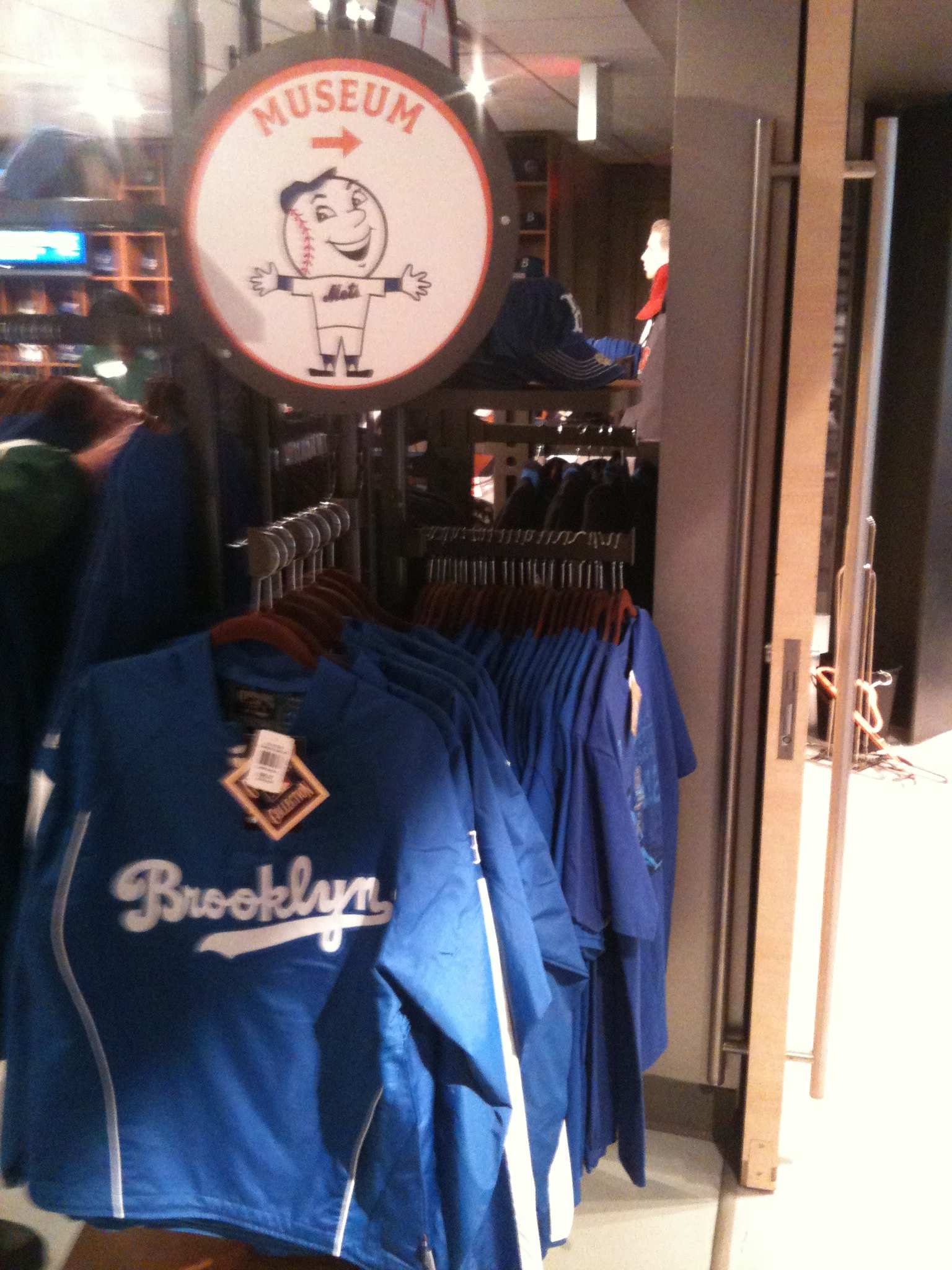
Yes black is a scourge on the face of the earth – but my main issue with the color is that it looks terrible on Mets merch.
However, I am wearing my new BP jersey for the first time and it looks pretty snazzy. Even on a fat guy. Plus it comes with number on the front! So as the king of fairness, I will say that this jersey looks nice despite the blackness.
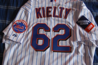
Here’s the jersey on actual Mets. As Media Goon and I have been saying all spring – they look much better in person.

Perhaps an alt based upon this design (lets lose the underarm black) would make the Blue camp happy, generation Piazza happy, give the Mets something new to sell, and give the fashion conscious something they can wear on their dates.
What’s really scary is this is the third straight day I am wearing a jersey I’ve never worn before.
Season jersey standings:
In person: Cream “me” 0-1. Mazzilli white pins 1-0.
Wearing jersey but not attending: 0-0.