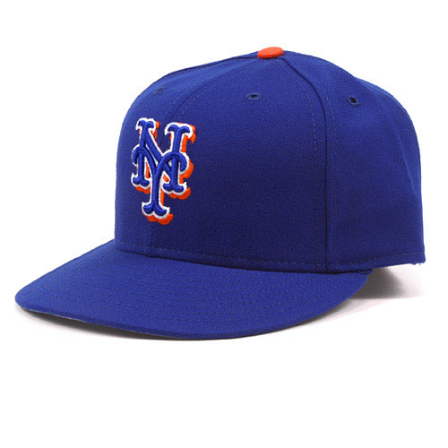
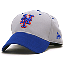
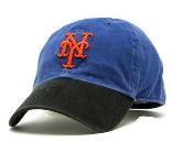
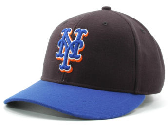
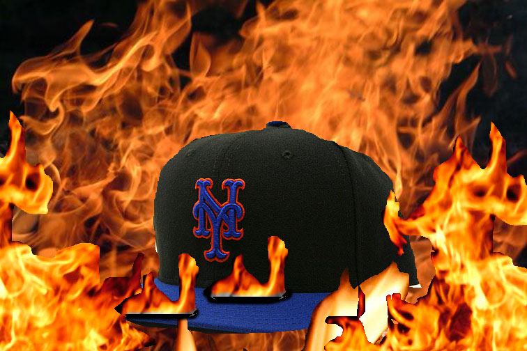
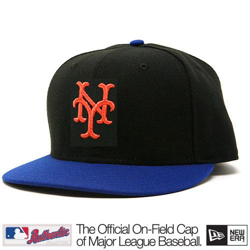
Even two more fan designed Mets cap ideas

Hi Shannon,

Couldn’t resist jumping into the latest alternate cap conversation. Here are two incredibly simple ideas, neither involving black. The first is to just outline the orange NY logo in white. The second is to take the all-black hat and make it blue, keeping the logo exactly the same–blue, outlined in white, with orange drop shadow. Of course, since both involve white, both would clash with the away grays… But we could do worse than having to wear the classic cap on the road.

Laurence
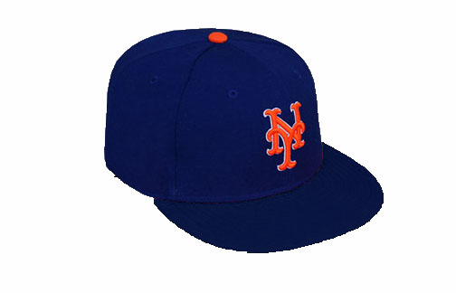
Personally, I like the attempt – but I see no reason to mess with the traditional cap.  As for the cap with the blue NY I bet it would look nice on a civilian, but on TV I would have the same problem I have with the hybrid.  You wouldn’t be able to see the NY.

Thanks to everyone who is sending things in – I am actually writing this on Wednesday night and intended to get through the emails but my eyes are getting heavy and a lot came in.  That sentence barely made sense.  Time for bed.  Anyways, your contributions are tremendously appreciated, please keep them coming.  Shannon@metspolice.com


Two more fan designed Mets cap ideas

FormerDirtDart, who made the big time when one of his designs made it on UniWatch, sent these over…

Two hybrids, if they must have them. one is a quick photoshop alternate to the current hybrid. The other seems to be a real life version of my bizarro world road hat.

Speaking of UniWatchUniWatch rules. Is writing about this stuff derivative? I think derivative would be a step up. Paul has been posting DIY jerseys for years. However as I was saying to Cerrone yesterday (name dropper), I gets tons of these in my inbox so clearly people dig it…and I dig it….so Paul, I kiss the ring with complete respect and awe! Everyone visit Uniwatch, and hopefully together we can rid the universe of black jerseys.

If there must by hybrid Mets caps: how about this one?

I took yesterday off from black-uni-talk, but it remains something that draws bug interest.

Let’s recap:  seems to be a desire by MetsCo to sell black merch.   Personally, I think the NY doesn’t pop on tv on a hybrid cap.

Sparks suggests this New Era cap might be a solution.

As well discussed, I don’t like hybrids, but since I try to explore solutions I’d like to see what this looks like on television.

Guest post: solution to the long hybrid Mets cap nightmare?

I have been enjoying the guest posts. Here’s a fun one!

Hi Shannon,

I am not a graphic artist, so the attached picture is just a quickie cut and paste. To my surprise, at first blush, the cap doesn’t look as good to me as I thought it would.

What do you think?

Michael

I will split my comment:

1. If black must exist in the name of marketing and they insist on wearing black – then YES this is the move. My biggest problem with the “hybrid” (I love that that term has caught on) is that you can’t see the NY on TV. It looks like a blur. In person on a civilian it pops more, but on an actual major leaguer the NY doesn’t stand out. This design solves the problem.

2. Ditch the black. Dress the team in blue, let civilians wear whatever they want – New Era has tons of options. If I ever have free time on a weekend again I’ve been jonesing to do another round of alternate cap commentary.

The Mets Police
Privacy Overview

This website uses cookies so that we can provide you with the best user experience possible. Cookie information is stored in your browser and performs functions such as recognising you when you return to our website and helping our team to understand which sections of the website you find most interesting and useful.