The horrible looking 2010 Stars and Stripes caps

The 2010 Stars and Stripes caps are out and well….YUCK

Yuck yuck yuck yuck yuck.

Funny thing is earlier today I had thought about getting a Stars and Stripes jersey.

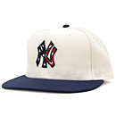
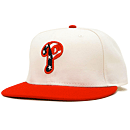
Here’s a look at the Phillies and Yankees – these are universally hideous.  Only $36.99!

I don’t want to be Anti-American but this is a dopey “tradition.”  I can still love America and hate ugly attire right?  Thanks to FormerDirtDart for the heads up.

11 Replies to “The horrible looking 2010 Stars and Stripes caps”

  1. I think these are a big improvement over previous attempts. The white cap solves the problem of the Mets wearing an essentially red cap or the Phillies wearing an essentially blue one.

    I’m still not a supporter of the idea unless 100% of the profits from the sales of all the Stars & Stripes merchandise is going to go to various veterans groups.

  2. The hats are horrible. The jerseys I think are fine. I agree with Paul that either the profit from the merch or a percentage of gate goes to veteran associations.

  3. Shannon if you don’t buy one of these, the terrorists win.

    These remind me too much of those Good Humor man hats we used to wear in the late 90’s

  4. i’ve said this before and i’ll say it again: if you’re going to go stars and stripes, why not go the extra mile and go s&s jerseys and pants. when the hats are just slapped on top of the existing looks, it creates something really sloppy and half-assed. like shannon photographed, they make s&s replica jerseys. why not make an authentic white and grey set for each club with pants with a blue/red/blue piping down the side to complete the look?

    overall though i have to say i’m a fan of the white crown. i just don’t know why the whole hat couldn’t be white. and i hate navy replacing royal in everything USA-uniform related.

  5. Better than last year.

    I wouldn’t wear a stars and stripes cap anyway. I like to my shows of support to be focused. 100% baseball, or 100% patriotic, not half and half.

  6. I have the original all navy one and like it. As Shannon would say, it’s a good “civilian” cap. The red one I disliked b/c it’s Phillies colors, and this new one is just plain awful.

    1. The first S&S cap was OK, I’m with Jason. I remember I kinda wanted one, but not at that price.

      I would get a S&S jersey if I could customize it.

  7. I have this hat and I actually like it. Of course, I also had a 5 dollar off coupon for a hat. If the Mets were smart and want to compete with the Yankees they should do the following: Drop black from their logo and go with one blue hat and 2 jerseys, the creme colored pin stripe and the road grey new york. They could wear the batting practice jersey as an alternate by adding numbers on the front but thats it. One hat, 2 jerseys, no black.

Comments are closed.