The Lost Mets Police Posts #1: What’s The Deal With John Buck’s Helmet?

As we celebrate the 10th Anniversary of the Mets Police, I thought it would be fun to go back and dust off some “Unscheduled Draft” posts. Behind the scenes if you write a post and don’t publish it, it saves as a draft. And there seem to be a ton of them. Some complete, some incomplete. Let’s have a fun stroll through the blog Outtakes.

This one looks like it was written in April of 2013.

….

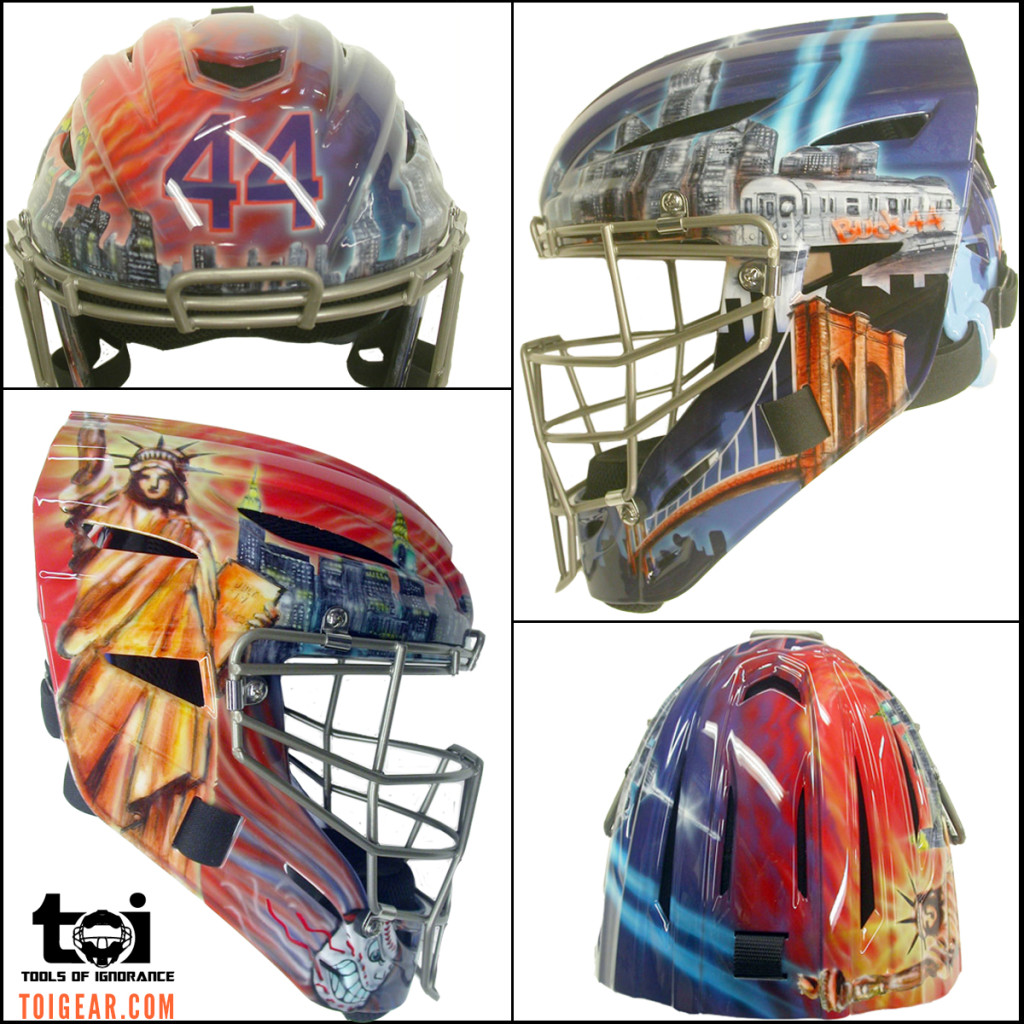
John Buck Mets Catchers Mask

If you have been watching the Mets on TV you may have noticed that new catcher John Buck’s helmet is very colorful.

It was produced by Tools Of Ignorance, designed by Voodoo Air, and features the Statue of Liberty, a #7 New York City subway train , and  Jay Payton’s  #44.  Turns out he is the only catcher in Major League Baseball allowed to wear a painted mask.  He’s been wearing custom painted masks for many years now, but a 2012 licensing agreement prohibited players from altering the helmets.  John got grandfathered in.  And there is a benevolent side to the story as well.  From CBSSports:

Buck, a nine-year veteran, says he’s hardly flashy and it’s not exactly his style to wear the most distinct piece of equipment on the field, but every year at the end of the season he auctions off his helmet for charity, and the bolder the design, the more money it seems to garner. 

“It seems like the flashier the helmet, the more they pay,” Buck said, “It’s for the kids, so I’ll do the flashy helmet.”
The Case Against Lowercase Uniform Lettering

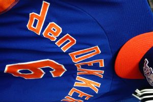
The Mets decision to invest in lowercase technology for the uniforms of Travis d’Arnaud, Matt den Dekker , and pitching prospect Jacob deGrom, has been met with mostly praise from the media.  Shannon was among those in social media who mocked the Mets use of an upside-down capital “P” in the past.

photo by Adam Rubin
photo by Adam Rubin

An article in the Wall Street Journal explained that Mets equipment manager Kevin Kierst, is the man responsible for the change.:

Kierst, irritated by the controversial upside-down “P” technique, set out to find a solution to the Mets’ orthographical dilemma. Since Major League Baseball’s uniform supplier, Majestic Athletic, didn’t produce lowercase letters, he designed a set himself in the hope of having them approved for use.

Now, with some help from Majestic, the approval of the league and a large amount of work by Kierst this winter, the Mets have an entire new alphabet at their disposal.

“It’s all about being consistent,” said Kierst, who has an artistic background—he used to paint signs on the outfield walls of minor-league ballparks. “If this is the way they spell their name, then this is the way it should appear on their uniform.”

I must respectfully disagree with Mr. Kierst and Mr. Shark.  I feel like I will be the lone voice here, but I think the new uniforms look silly and are improper.  So, I will take this opportunity to make  my case against lowercase lettering on uniforms.

ALL CAPS is ALL CAPS.  Daryl Strawberry’s uniform read “STRAWBERRY,” not “Strawberry.”  Why is a lowercase letter important just because the proper spelling has it in the beginning of the name?  

If the Mets want to leverage lowercase technology for Travis d’Arnaud’s uniform, it is silly to use “d’ARNAUD”.  Shouldn’t it say “d’Arnaud” if we are going to go that route?  I contend the best use of lettering is to be consistent, and stick with “D’ARNAUD”. 

As an example, look at this book about the famous painter Vincent van Gogh.  Notice the cover reads “VAN GOGH,” not “van GOGH.”

vangogh


I think the efforts to correctly spell athletes names is an honorable endeavor, and I agree that using an upside-down “P” was goofy, but this just does not sit right with me.

Whether you’re with me or against me, let me know on twitter or in the comments section.  Follow me @verceman and CC: @metspolice I believe there are more ALL CAPS purists out there than we realize!

Another fan-mockup of a possible 2011 Mets jersey change

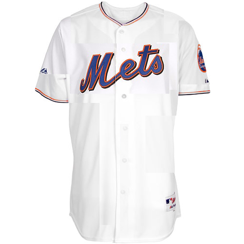
Laurence checked in regarding the rumor that the Mets are considering removing the piping from the 2011 jerseys (and provided this mockup.  Is everyone better at photoshop than I am?)  Laurence says:

One way to avoid the inevitable Dodgers comparison is to look around the league and see what other kinds of piping are out there. The Angels, DBacks, Giants, Nats, Padres, and Pirates all do a subtler two-tone piping that I think is really snazzy. (Come to think of it, the Mets’ giant-NY throwbacks had it too.) Anyway, I did a photoshop hack job to see what it might look like, and I have to say, I’m hoping they look like this.