Quick, how many strikes are there?
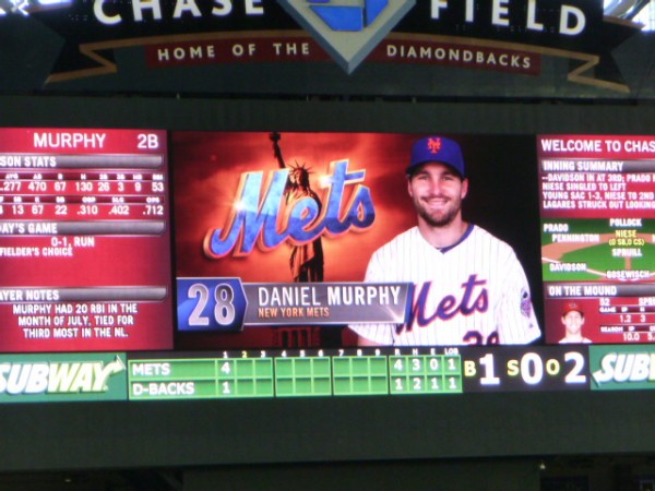
Correct!
Too bad that scoreboard is in Arizona.
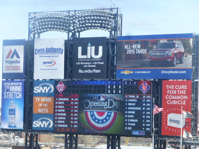
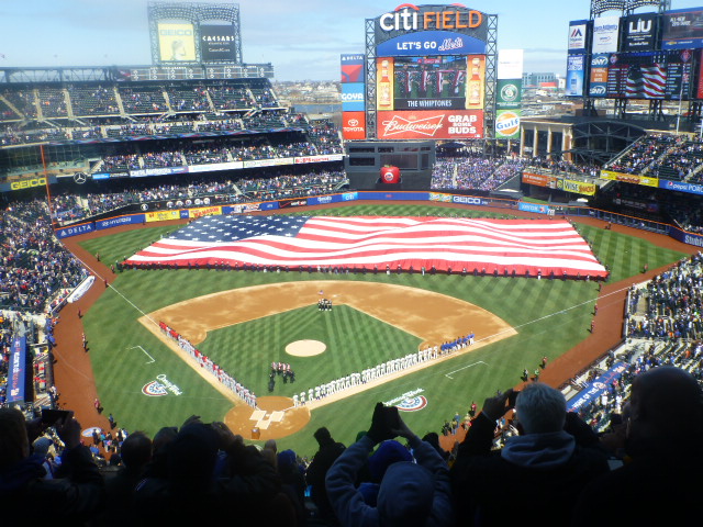
Now, tell me where that info is on this scoreboard in Queens? (Yes it is not as zoomed in to be fair, I only have the photos I have.)

The Mets have done several things.
Junior (and others) tell me that the BSO used to be prominently displayed on the bottom of the center field scoreboard. I have a shaky memory, but I know my muscle memory kept looking to center field where there was no BSO, but I was constantly reminded of upcoming promotional dates. Can’t we have both?
So I looked to the main scoreboard where the BSO numbers have been replaced by dots. Dots are annoying. Dots make me have to go “one, two” in my brain instead of just seeing a 2.
My small brain is also not good at reading vertical dots.
Both Junior and I struggled with the fonts as well. I may be getting old but his eyes are sharp and he found the red on the Nationals side of the board hard to read.
Now did anyone complain about the scoreboard in the past? No. And we complain about everything.
So Mets…just put it back the way it was. You haven’t monetized anything in the new design so there really shouldn’t be any reason not to return all the fonts and design elements to the old way. If it was good enough for the All Star Game it should be good enough for Wednesday night against the Nationals.
Now I know how this goes. You will completely ignore me. I will mock you on twitter. More and more people will agree with me. You will eventually switch it mid-summer.
To summarize:
– Add a BSO count to center field
– use numbers not dots.
If you have a good case for dots I’d love to hear it.
@metspolice here’s a good pic of the scoreboard the way it was last year w/ B/S/O (also great pic of my daughter!) pic.twitter.com/zoxmWSlSBK
— Laura Lapidus (@MetsMom) April 1, 2014
