Reader Comments About The 2010 New York Mets Uniforms

jmp has left a new comment on your post “Adam Rubin: Off-White Retro Home Uniforms for New…“:

The original Mets home uniforms were white with blue pinstripes.

The snow white uniforms with the blue piping is supposedly an homage to the team’s Dodger heritage. If one buys into that argument, then surely the use of cream colored uniforms at home would be an homage to the team’s Giants heritage, right?

The big thing is that those who complain that the Mets honor the Dodgers to the exclusion of the Giants can’t really make too much noise about a cream colored home uniform… 

To the best of my knowledge, the cream wasn’t worn by the New York Giants, although it is worn by the SF Giants.


Using your logic, the black on Mets uniforms would be an homage to the NY Giants on the 1950’s.


I would actually be less bothered by a black and orange hat than I would by the hybrids.  


Out of curiosity, take a look at the links in this post where someone de-blued a Mets uniform. (And everyone bookmark uniwatch.)


Here’s an article I wrote from earlier this summer with some uniform suggestions for the NYM’s.

Anonymous has left a new comment on your post “New York Mets Uniform Survey Part 2“:

The black just flat out doesn’t look good. It looks ghetto, low-rent, trailer park, 1998 expansions. Of all the expansion teams to enter baseball, the Mets were the only franchise that actually came up with a uniform that stood the test of time — basically unchanged from 1965 to 1978, as the Senators/Rangers, Colts/Astros, Angels, Royals, Padres, Expos, Royals and Brewers/Pilots changed looks and logos every five years or so. That Mets uni stands up against those of the Cubs, Red Sox, Yankees, Cardinals, Dodgers or any other “classic” team. Ever notice how many expansion teams use pinstripes with team names on the front and a logo patch on the sleeve? Where’d they get that idea?

And the pinstripes were to differentiate the Mets from what came before (Giants and Dodgers) moreso than to mimic the Yankees. The Cubs and Phillies have worn pinstripes for decades. Were they copying?

The black uniforms look like something the Diamondbacks, Devil Rays, Marlins or Rockies would have trotted out in the ’90s. Dated as the ’80sracing stripes. There’s a reason why the D’Backs and Rays abandoned those designs for something more traditional, and why the Marlins are redesigning when they move to Miami. But some posters would prefer to look like a low-rent ’90s expansion team than a classic ballclub. 


Main Mets Police page
Follow us on twitter @metspolice
Facebook page
send ideas/guest columns to shannon at metspolice.com

Bookmark and Share

(Repost) The New York Mets Uniform Survey

We’re always picking up new readers, and it occured to me that you may not have seen the uniform survey sent out by the Mets earlier this year.    So for your convenience, here it is.  Interestingly “cream” uniforms weren’t part of the survey.

1.  How many tickets do you have and how do you rate youself as a fan (for example die-hard).
Page 2 asks which hat do you like better?
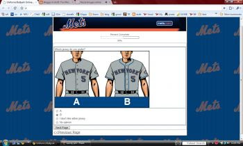
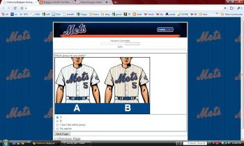
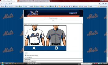
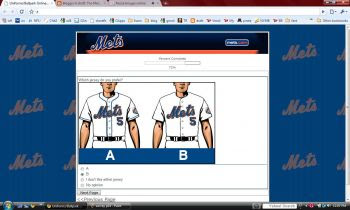
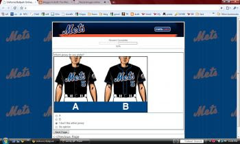
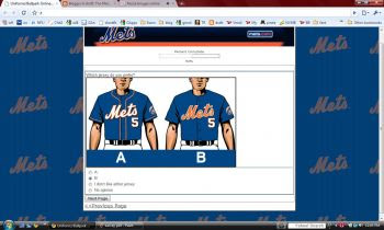
Page 3 asks which of these jerseys you prefer?


4.  Do you think the Mets should wear the pinstripe (home) jersey more often? Yes/No/No opinion
5.  How often should the Mets wear the pinstripe (home) jerseys?
a) All home games
b) saturday & Sunday home games
c) once per series
d) Sunday home games
e) no opinion
6.  Do you think the Mets should wear the white (home) jersey more often?  Yes/No/No opinion
7.  Do you think the Mets should keep the black jersey?  Yes/No/No opinion
8.  Slide 8 is phrased really interestingly.  I don’t know if it was positioned this way because I selected NO to #7.  I have included a screen capture on the left but I doubt you can make it out.


Why do you think the Mets should not keep the black jersey?
a)  Black is not one of the Mets colors
b)  I don’t like the color black
c)  Black is not part of the Mets history
d)  It doesn’t look good on the field
e)  It’s time for a change
f)  Other (specify)
9.  The next section will compare jerseys to see which you prefer – the one on the left, the one on the right, “I don’t like either one” or no opinion.

So for me, I don’t like the NY because its Yankee like but at least it isn’t black – devil’s choice but I stuck to my guns and said I don’t like either one.
The next section of the survey is all about uniform choices.
I pick neither black.
Here I went traditional, although the one on the left is fine.
This is interesting.  It doesn’t come across well here, but on the survey the one on the right looks charcoal-ish.  You may recall there was a rumor of charcoal uniforms over the spring.   These also unfortunately have black shading.   Vote left.
Since we are not the Denver Broncos I picked neither.   Either of these are better than black, but underarm colors remind me of warm up jerseys.
I went right.
16.  Should the Mets name the bridge in Center Field at Citi Field?  Yes/No/No opinion.
I find that question interesting because that too has been a topic on the blogs.   This really makes me think that the Mets are paying attention to the fans.  Maybe all this stuff works?
I assume the quiz would branch off, here – I answered yes and got the next question:
17.  What do you think the bridge should be named?
a)  Amazin’ Alley (wow thats awful)
b) Casey’s Crossing (corny)
c)  Gil Hodges Bridge (I like the idea but there already is a Gil Hodgers bridge)
d)  Miracle Mile Bridge (are they opening some strip malls?)
e)  Piazza Path (let’s calm down with the Piazza thing, and I’d be afraid of this because, well, deep down you know)
f)  Seaver Bridge (sure)
g) Ya Gotta Believe Bridge (what, no option for Catch The Rising Stars Bridge?)
h)  Other
I went with Seaver.
18.  Do you have any other comments regarding the Mets uniforms and/or Citi Field?
Y’all can imagine what I mentioned (nicely).

Main Mets Police page
Follow us on twitter @metspolice
Facebook page
send ideas/guest columns to shannon at metspolice.com

Bookmark and Share

NBCnewyork.com’s Commentary On 2010 New York Mets Uniforms

Some good stuff here on NBCNewYork about the uniform change, including a link to a color photo of vintage Seaver.  Nothing new, but the spin is that once again the Mets tried to get something right and failed.

Why oh why would they keep the black shading?

Main Mets Police page
Follow us on twitter @metspolice
Facebook page
send ideas/guest columns to shannon at metspolice.com

Bookmark and Share

ESPN Confirms Bobby Valentine Hire: Will Be on 1050 And ESPN New York Website

Wow busy week in Mets news…..

Looks like we can forget about hoping we get V as manager in 2010.   Also, this is the first official mention of an “ESPN New York” website that I’ve seen.  Been speculation up until now.

ESPN has been doing very well with local sports websites in Chicago, Boston and now Dallas.

From Espn.com

Valentine, who previously worked for ESPN in 2003, will take on expanded duties in 2010. He will appear on “Baseball Tonight” and 1050 ESPN Radio in New York, and contribute to ESPNNewYork.com, the local ESPN sports site that launches next year.

Main Mets Police page
Follow us on twitter @metspolice
Facebook page
send ideas/guest columns to shannon at metspolice.com
Bookmark and Share

Jay Horwitz Has No Comment On Details Of 2010 New York Mets Uniforms

From mets.com

Though Jay Horwitz, Mets vice president of media relations, wouldn’t detail how the club would alter its home uniforms, the New York Post reported on Tuesday that the alterations could include a departure from the pinstripes that have been a part of the home whites since the team’s 1962 inception.

Main Mets Police page
Follow us on twitter @metspolice
Facebook page
send ideas/guest columns to shannon at metspolice.com
Bookmark and Share