UPDATED AGAIN:
From UniWatch:
The 2010 Mets uni info buried in the middle of this report is accurate. The related but slightly different report that ran in yesterday’s N.Y. Post is NOT accurate.
Uniwatch is as good a source as we’ll get. So, what does everyone think?
EVEN MORE UPDATED: Paul from Uniwatch was quick to respond to an email about “black”. The “retros” do indeed have the drop shadow black. Now we can call the Mets idiots all day.
Below is what I had posted earlier this morning, some of which is now irrelavant.
______________________________________________________
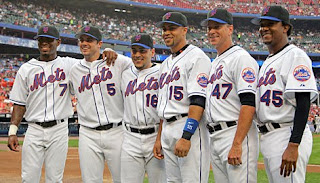
From what I am gathering from what Rubin says in today’s News and what Hubbuch said yesterday (scroll
down the site), the Mets home uniforms for 2010 will be:
Primary: white no pinstripes. The ones they wore most of the time
this season.
Alternate: an off-white pinstriped version like what was worn by the
1969 Mets at the celebration.
No word yet on how much black if any. (as I wrote in the update – the retros have black. The roads will be the same)
My take: I like how the retros looked. I’m happy. Will be happier if
the black leaves. (it isn’t). I prefer the pinstripes to the no-pins but I have
warmed up to the no-pins especially on civilians.
Stay tuned…
UPDATED:
Here is what Rubin said:
The Mets plan to go retro with their pinstriped home uniforms next season. Those uniforms will change to off-white, as they were in the 1960s, from their current bright white. That will also serve to differentiate the pinstriped uniforms from the solid home uniforms, which will remain the brighter white.
Read more: in the News

The debate now becomes is whether or not the uniforms were actually off-white in the 1960’s.
This is what the 2009 Giants are wearing…looks creamier than the above.
This is from 2007….the “snow white”


