The Mets Police welcome guest posts. If you have something you’d like to get out there just email it to [email protected]
Sparks writes:
While I’m always up for some good uniform discussion, seeing that DiamondVision graphic of the Mets’ record in each uniform/cap was just more than I could handle. There’s a fine line between breaking convention and making a mockery of things, and that graphic was an watershed moment. It had a message. The message was “You know that fine line? The Mets have pole-vaulted right over that sucker.”
So what would I do with the Mets unis if I were calling the shots? Glad you asked! I’d do this:
1) Pile every black sock, belt, and undershirt into a big pile, douse said pile with some highly combustible liquid, and light it on fire. I really don’t think my motivation here needs any elaboration.
2) I’d change that #@$%ing orange button on the blue cap back to blue. Maybe that’s just a unique pet peeve of mine, but only the black socks & sleeves paired with the blue pinstripe uniform annoys me more than “The Dot.” Seriously, this would be the second thing I’d do after lighting the bonfire discussed in #1.
3) As much as I hate to admit it to Mets Police, I actually dig the black jerseys and the caps that go with them. However, the Mets uniform herd is in desperate need of thinning, and the black tops are the weakest link. So goodbye.
4) I would remove the drop-shadow from the the pinstripes and deem them the default home uniform. And since Charlie Samuels apparently doesn’t own a dictionary, let me elaborate by saying “default” means the team would wear that uniform the most frequently. Here, I will add that I honestly have no problem with the “snow white” jerseys, and don’t even mind them being the most frequently-worn jersey. They look awesome with blue caps/socks/sleeves. But again, the herd must be thinned, the pins simply have to remain, and there can only be one alternate. Which leads me to….
5a) I would introduce a blue alternate jersey, to be worn on Sundays, holidays, and “getaway” day games (in this context, “alternate” means something is only used occasionally–see how that works?). This jersey would combine the two designs from the recent uniform survey, with both orange scriptand the orange piping:
http://3.bp.blogspot.com/_EcBfXMyQha4/Sg7lry3v20I/AAAAAAAACKI/rPDKeJ7Vbrk/s400/surveyp11.jpg
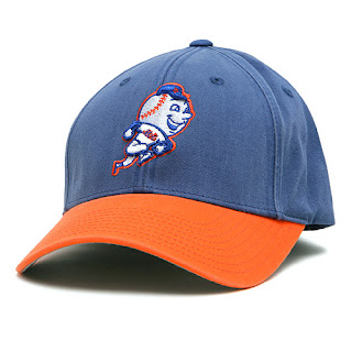
5b) I would pair these new jerseys–always, no mix and match–with an official 5950, royal-blue-crowned version of this cap:
http://mlb.imageg.net/graphics/product_images/pMLB2-4828936dt.jpg .
How can anyone argue with a Mr. Met logo? Also, the orange bill would nicely match the script and break up the veritable ocean of blue elsewhere in the uni.
6a) I would keep the current road uniform, but also without the drop shadow. That design was one that never needed to be improved upon, and whoever decided to change it in the first place way back when should have been beaten unmercifully until they came to their senses. The only difference between my version of the road jersey and the original 1962 version would be that I’d retain the current piping around the sleeve.
6b) As much as I like the idea of a road cap, as we saw in the last Yankees-Mets game in the Bronx:
http://www.nydailynews.com/blogs/yankees/docs/images/500_delgado-jubi.JPG
the current two-tone lid simply doesn’t hold an aesthetic candle to the blue when worn with the road grays. The choice here is to either stick with the blue, or come up with something better. I’d propose–but not commit to–a gray-and-blue version of the current black-and-blue lid:
Adoption of the gray cap/helmet would depend upon how it looked it 3-dimensional real life. Much like the original 1997 white alternate cap, that gray cap might look a lot better on paper (or in our case, a computer screen) than in practice. If that turned out to be the case, just wear the blue cap all the time, and save the additional merchandising for somewhere besides the playing field.
Now having finished my work, the Mets would have one home, one road, and one alternate uniform combination, each with its own appropriate and predictable time to be worn. That accomplished, I’d sit back and watch karma deliver the Mets a World Championship for no longer being a bunch of doofuses about what they wear.
-Sparks
Thanks Sparks. I have found myself increasingly interested in the idea of a blue Mr. Met cap on Sunday.
The man in the front row is wearing one (the guy at “Wright’s” 10 o’clock….I couldn’t get a clear shot.
www.metspolice.com
@metspolice
 It’s fascinating for two reasons.


