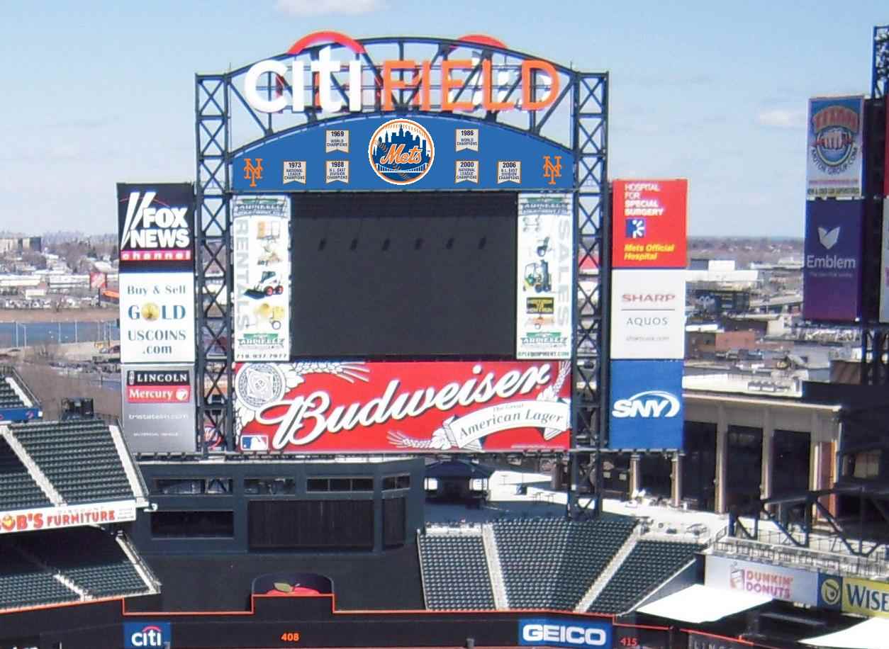
Hi, you’re probably looking for something about last night’s awesome/terrible Mets game or rain out. Â Well, I’m actually writing on Sunday afternoon. Â The Actual Athletic Activity has left me exhausted, and my brain is hardly functioning so I checked gmail hoping someone had sent something in – and sure enough Former Dirt Dart had (whew and thanks).
Whatcha think of this?
I’m digging the blue and the Mets ball…less into the pennant thingies (I never really liked the design of those.)
Best of all now we have a new thing to argue back and forth about – it’s not uniforms or a fence, it’s the scoreboard!
As for last night’s game? Â I dunno, I probably fell asleep at 8:30. Â Hopefully I have found some coffee and am writing something actually topical now. Â See you in a few.


I like that idea. Maybe throw retired numbers on the bottom where the Budwiser sign is. Not much room for new banners, but not many expectations for new ones either. but you gotta put them on the back too.
Yeah, when I improve my revolving 3-D image photoshop skills I get right on mocking up one with the reverse side done too. Until then you’ll just have to use you imagination…lol
Personally I’m happy with the retired numbers on the Left Field wall (“The Great Wall of Flushing” credit to Faith and Fear in Flushing). Plus, not likely you’ll see the team take down advertising space.
And, there’s plenty of room for more banners, you just reduce the size as it gets crowded. Or you can relegate the lesser banners to running down the ironwork, to the left and right
Looks too busy for me. I made a similar suggestion last year, where I suggested the Mets add two exclamation points to the Lets Go Mets representing their championships.
http://www.ceetar.com/optimisticmetsfan/2009/05/22/new-citi-field-scoreboard-idea/
I know you like the Let’s Go Mets. I just find it king of cheesy (like you said..lol) and a bit pleading. I also felt the place needed a little more official Mets branding. And, you couldn’t exactly put up a Mets logo bigger than that damn Citi Field sign, and not disrupt the flights in and out of LaGuardia.
well, since it’s a sponsored sign/field of course it’s gonna be huge 😉
I just think your version looks a little busy(and likely hard to read from a distance) Maybe the banners in a strip just underneath?
I’ll stick with the actual scoreboard design. The mock-up is a little too busy for my taste.
I think the championship banners are more prominent when displayed on the outfield wall rather than getting lumped in with all the scoreboard advertising.
Yeah, they shouldn’t be lumped together with advertising..
http://farm4.static.flickr.com/3538/3835612896_c07fd77494.jpg
OK, prominently, without advertising like at Shea…
http://farm3.static.flickr.com/2035/2355820177_3f59ff208e.jpg?v=1239602487
http://www.visitingdc.com/images/shea-stadium-address.jpg
http://farm1.static.flickr.com/208/460546727_5fec61bf9a.jpg
OH damn…never mind
i wish they could put the championship banners on the recently adjusted wall underneath the HR apple all along CF. I think that would look pretty awesome. Seems like the perfect size to do it. Only problem is i dont know what the batters eye rules are.
The Championship banners need to be prominently featured more than they are now. Problem is the Mo Zone is too busy…I guess they could move them into left centerfield
The logo is good but everything else makes it look to busy. The logo reminds me of the logo that was on the center top of the scoreboard at Shea.
Too busy just like the HR wall. I can deal with what they have now, but its should be electronic or something. Like the Phils have liberty bell, Mets should have something like a Mr. Met or what Twins also have that lights up on HR. What about a roaring #7 train on scoreboard too?
If I build the place, the Mets logo would be a giant one where CitiField on main scoreboard.
The Mets were going to use the 7 Train on the score boards but due to MTA being in the Red the score board stop was cut..