There is a feeling I am really starting to get. Seems to me that a lot more blue and orange is being used and less and less black in a lot of the Mets materials. I just received my 15 game plan ticket book and it looked very classic to me.
Here is the front cover of the ticket book:
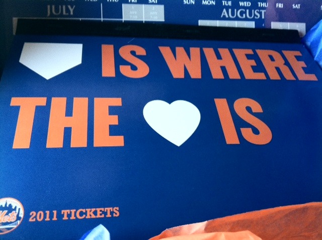
Blue,orange, and white for the slogan. I am not a fan of the slogan but everything can’t be about me. Some of you (Shannon) can nitpick about the use of the black binding if you want though.
Upon opening the book and getting to the tickets, you see:
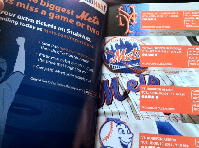
Classic looking. I like the orange box makes the text stand out more. One hat and three jerseys.Nice.
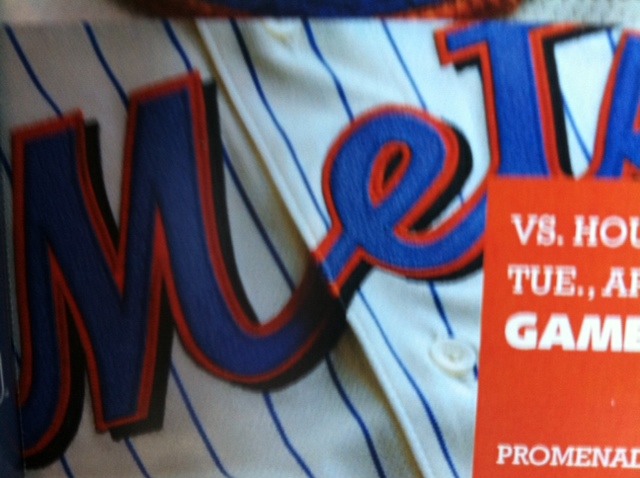
Let’s take closer look:
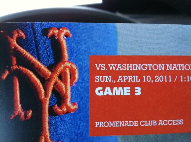
Classic blue hat. No hybrid. No all black.Just classic blue. People it might be a sign. I think it might be time for the Blue Cap Army to make a comeback.
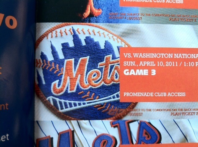
Mets patch no black in it.Looks to me like it’s the sleeve of the pinless home jerseys. Again the logo looks classic. Yes, I know Shannon it’s missing the little NY.
The cream colored home alternate jersey. Nice jersey. Black drop shadow not so nice. Only “black” included in these tickets.
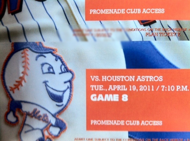
This seems to be the throwback NY jersey from a couple of years ago. Look at that smiling Mr Met that is on the sleeve of that jersey.
I might be totally wrong but it does seem that the Mets look like they are trying to build upon their tradition. I just love the look of these tickets. Mock me if you guys want, but I am having a really good feeling about the start of the regime change.It seems that it is infiltrating the whole organization with more classiness.
That Mr. Met is from the Cooperstown version of last years Majestic authentic jacket.
I do love the new look. It just continues with my belief that we are in a “cleansing” stage. The cleanse is almost complete and now is the time to embrace it. Lets face it, all thats left is the diehards. We all have a common goal…so lets get behind this team (whatever they may be). Maybe Sandy really will listen to us. LETS GO METS!
@Corey I could be wrong but look at the picture of mr met carefully. You can see the blue ny lettering next to mr met
Can’t find the Mets version but I think the blue is consistent with the pattern of the jacket
http://www.majesticathletic.com/Boston-Red-Sox-Cooperstown-Therma-Base-Premier-Jacket_1543895101_PD.html
Got my 15-game pack the other day also. I got a big blue box with the tix in and nothing else. Seems like something was missing. Did you get anything else with it? Just looked too big to have just a small book in it…
http://www.sportscollectorsdaily.com/mets-to-wear-auction-throwback-jerseys/
The mr met is on the sleeve and te sleeve is folded over in the pic on the ticket by the N of the Ny throwback
Got my tickets yesterday and after getting a close look, it is definitely the jersey.
Hey Robert, if you look at the other post I wrote today the 15 game package had a mets watch ith it.
Just read that a few minutes ago. Looks like the Mets will be hearing from me tomorrow. I want that watch… By the way, are they just not having a pre-season workout this season? I liked those the past two seasons.
There is no pre-season workout because they don’t have an off day before the home opener and they open in Fla. The Mets tweeted that.
Good question Robert. I haven’t heard anything about that this year. But I think since they are starting the season down in fla. It makes no sense to try and do that this year at citi field. It would be a logistical nightmare. Let the mets know about the watch. Everytime I have dealt with the mets about a ticket problem or a problem in generalbat citi they were quick to answer and correct it.
Wow thats a great package!…Have a great time!
Went to game today. It got rained out. I was shocked that the MEts were offering a money refund.
http://floridametfan.mlblogs.com/
I switched my 15 game pack for the 18 game flexpack. I got the flex pack tickets more than a week ago – plain tickets, etc. I’m more than happy with my 3 extra games and adding an extra subway series game. I’d rather have that than the watch – but the watch is nice and the tickets do look really good.
It was like opening a Christmas present. I was excited. Hopefully by the grace of god I will be opening a similar box with playoff tickets in it later this year.
Interesting that they would use the NY “throwback” on a ticket design this season. I wonder if it could be making a reappearance this year.