Continuing a look at the greatest article ever
It was big changes, where they really wanted to change the whole look. And my thinking was, there’s nothing wrong with this look. It looks great, the cap looks great, the road jersey with the Red Sox-y lettering is classic — that’s my favorite Mets jersey, in fact, and they wanted to make big changes to that. But I said no, you don’t want to do that, you don’t need to overhaul your look.
That’s the killer quote. It’s what makes Halfacre, bringer of the black, a surprisingly sympathetic figure. One can only image the horrors that might have befallen the Mets.
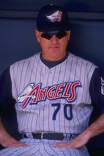
Let’s take a look back to the state of uniforms circa 1998 (Yes I know that’s not Terry Collins)
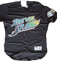
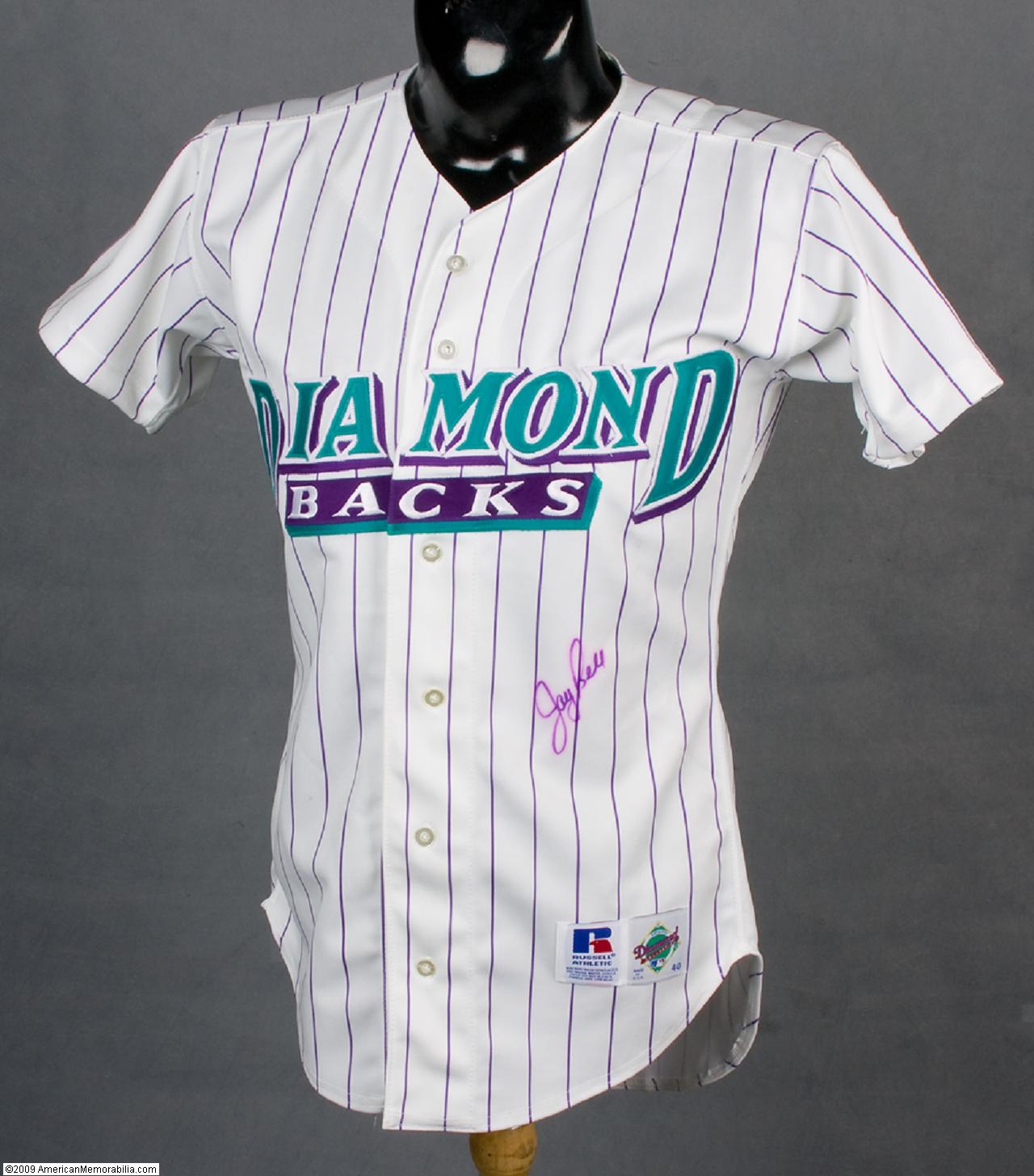
That’s scary. Imagine crap like this..
Can you imagine what might have happened?
Matt did…
Hi Shannon.
Just a real quick thought about the Lukas column & your posts.
My initial thought when I first read it was, “would we have been better off if they were a complete & utter disaster?”, meaning would they have been SO bad that everyone would have been in an uproar & Fred would have had no choice to go back to the traditional look. Instead, we get what we have & most people accept it & the proud minority are huddled in our quiet corner of the internet complaining.
Just a thought. 🙂 Keep up the great work!
Matt
Charter Member, Blue Cap Army
…
If you are new to Mets Police, the Halfacre article is here on ESPN’s Uni Watch…it chronicles how black uniforms came to Flushing.
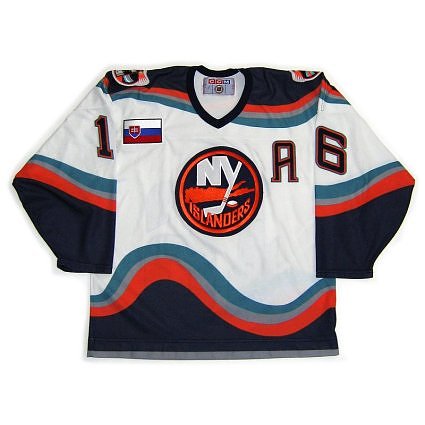
I think you should have put the Stan Fischler gordan’s fisherman islanders jersey there too. Now that was ugly.
well, except that in 1998, shannon’s target year, the isles had already made the switchover from fisherman to NYI crest, so it was representative
that being said, the isles fisherman falls into one of those “so bad it’s good” categories; none of the crap the mets have trotted out since 1997 meets that criterion;
that stars and stripes jersey is not ugly…it is u-glee.
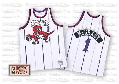
as a kid i loved the mets “classic jersey…with the worlds fair logo on the side.
Uh I remember the fisherman jersey all too well. not only was it ugly it was a target of ridicule and as an Islander fan it was horribly embarassing. Now knowing the Wilpons that is the dark scary road they would have taken us all. The horror.. the horror.
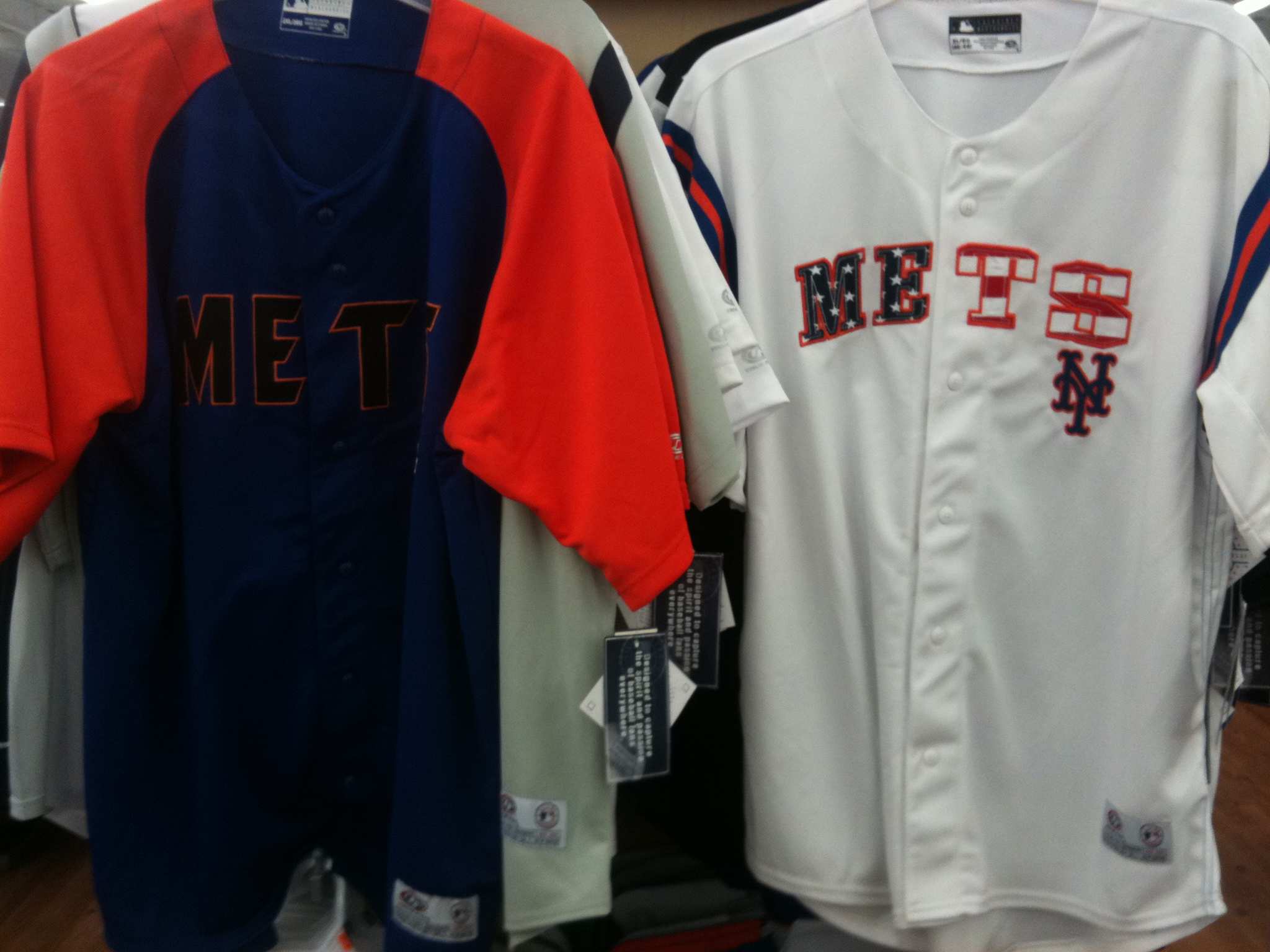
This picture has all the uniforms the Mets need…bottom left is the road (preferably with same varsity numbers)…middle two are the home…bottom right is the nicest alt they had…just thin the trim and make it button down.