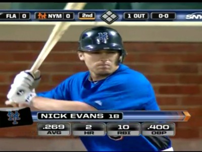
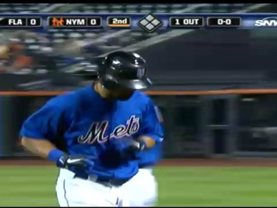
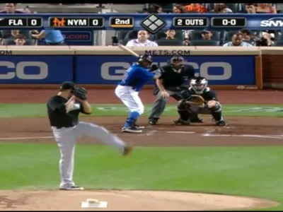
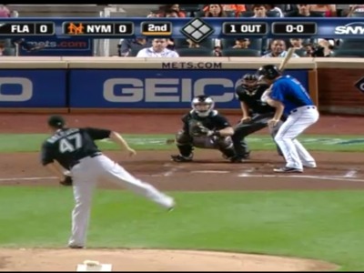
Reyes is back and the Mets are wearing their BLUE Batting Practice Jersey during the second game of the double header. Thanks to @sclevine on twitter for the heads up.

From Adam Rubin over at ESPN NY
For the second time this season, the Mets are wearing blue uniforms. This time, though, it really is just their warm-up jersey.
On Aug. 5, for Fiesta Latina, the Mets trotted out new blue uniforms (pictured above), which they likely will make part of their regular rotation in 2013. The Mets are not allowed to wear the new uniforms for two seasons because they must be submitted to MLB by May of the previous season. (Full explanation here.)
“These are our BP jerseys, which MLB permits the teams to where in games,” a team official said about the attire for Game 2 of Monday’s doubleheader. “Just mixing it up a little bit.”
…
Shannon: Here’s the blue from the 80’s which of course looks better because the letters are not black.
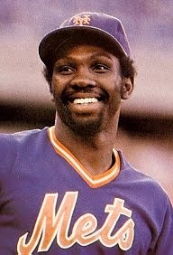



I like the “New Blue” ones better!
LETS GO METS…SWEEP THE FISH!
The Mets script in black/white/orange is hideous.
Never mind the fact that they look like they got dressed in a dark closet again, they have to at some point come to the realization that black and blue just doesn’t go together. If it looks ugly in a bruise why would it look good here.
I like the Blue Jerseys but I have to agree the Black script looks crappy.
Looks horrid, batting practice jerseys should not be worn for official games. The blue Los Mets jerseys were a nice look. The BP jersey with the black hat, not so much. The Mets took the good feedback from the Los Mets jerseys and went too far with this. Leave it to them to screw up a good thing.
I agree this looks ugly, but it could be worse; I own MLB 10 The Show & when I look at Tobi Stoner’s player card, it’s the black cap with the white alt.
I would rather see the black jersey than the blue BP…it is that ugly. The Mets should have worn black…the Marlins wore black so that could have been a bit of history. Wonder if MLB allows that?
I got home late last night and didn’t want to comment until I saw them in motion, which I just did via a DVRed SportsNight.
I fully expected to hate this look after seeing it posted here, but I don’t. They’ve certainly worn worse. I’m not a fan of the black writing on those jerseys (wouldn’t mind seeing a blue-on-blue look like the Giants’ black-on-black from a few years ago), but here are a couple of positives just off the top of my head:
1) blue socks
2) the color of the cap matches the color of the writing on the jersey
Those two facts alone make this combination superior to the butt-ugly whites-and-hybrids Fredenstein look.