I woke up in the middle of the night and started thinking about the blog and how I’m so appreciative of  how popular the blog has become, and how I didn’t set out to do this.  Before I get to some jersey related thoughts, let me tell you how you and I come to meet today.
I had been thinking about trying out this blogging thing I had heard of, and a friend had recently started using the Blogger template, which is a Google product, so I logged in using my Shannon Shark account (Shark is the dog, and it was one of my “register for ticket lottery accounts”. Â “I named the dog Indiana.” Â I quickly realized using the alias had and has convenience of me not having to explain to the boss why I’m blogging all day, even if I pre-write most of what you read..and here two years later it’s become my pen name.)
Next I had to pick a name and a topic. Â Well, I like the Mets and I like Sting’s band….Mets Police. Â There was no plan to hunt out misinformation on fan bricks – just a guy who liked Sting and Lee Mazzilli. Â The first post complained about the Mets not wearing names on the back of their uniforms on Robinson Night. Â If there ever is a reason to have names, it is when all players are wearing the same number.
Then the wheels starting coming off Willie, the team collapsed again, Shea closed down, a new stadium was built, some plexiglass blocked my view, everyone got injured, people started sending in items, I got a little better at writing and choosing topics, some online friendships have been made, I learned there are others who like to wax philosophically about the 1970’s – and here we are, having an ever-evolving conversation about our favorite baseball team and being quoted in the New York Times. I spent most of the winter in negative mode, lately I’ve been more positive. Â Some day I may even change my tune on black uniforms, though I doubt it. Â which brings us to….
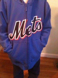
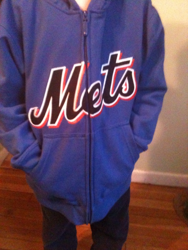
 My mom bought Junior this sweatshirt. Â I like it. Â Yes the letters are in black, but it is nice looking. Â Since I have been campaigning for blue jerseys to replace the hideous black jerseys, perhaps a design based upon this color scheme could please both me and the Mets marketing department. Â This year’s batting practice jerseys are a step in the right direction – they would just need to eliminate all that underarm nonsense (which is MLB-wide and looks terrible on Yankees jerseys). Â Similarly, the 2010 batting practice cap could be salvaged with less flourishes. Â Perhaps at the Treaty of Flushing this can be discussed.
I contacted Mitchell & Ness about buying a 1978 road Lee Mazzilli jersey or even a blank one. Â No dice.
I feeling Metsy today, I may buy a Saturday plan.

Chief, I just want to see the team look like the Mets again and stop looking like the Dodgers. Every time I turn a game on, and see them in plain white, and not pinstripes, it immediately puts me in a negative mood. If the organization is not listening to the fans, they should listen to their own radio guy, who comments about real Mets’ uniforms every time they wear them. Blue jerseys? Black jerseys, hate the idea of them both. Blue pinstripes at home, grey on the road, end of story. If that makes me old fashion and anceint, I can live with it.
Pfh I am with you. I love the pinstripes. It is a nice classic look. I love Howie every time he comments on what the Mets are wearing. The original uniform design was arguably the best, maybe the smaller road numbers seen by 1973 better than the giant ones of the 1960s.
From time to time you will see my refer to the Treaty of Flushing. This is a hypothetical peace treaty where Dave Howard and I sit down in a subway car. Since all treaties are negotiations, things must be conceded – and I am willing to concede pinstripes and complaining in exchange for no black. If I ever buy the team I will bring back pinstripes and move the team to Lee Mazzilli Stadium.
I’m going to write the dissenting opinion here and say the blue script on black looks far better than the black script on blue. The black script is just unnatural and I really think it makes the blue look pale in comparison (look at a BP cap vs. a orange-NYed cap–they don’t even look the same color until you put them side-by-side).
I hate the drop shadows and having 2 alternate caps, but give me the black alts over the current BPs and that sweatshirt any day.
Chief, I have to disagree with you on one point: Mazilli-Milner Stadium.