 Wow I have been blogging for three hours and I’m getting sleepy…here’s one more set for y’all tonight. Â I still have lots and lots of photos to go through, plus I haven’t even opened the one’s Media Goon sent (and he is a much better photographer) and I didn’t post any from the stores yes, more merchandise to comment on) and the Blue Cap Army hasn’t met yet, and Opening Day pics and….well, this should be a good week for content.
However, my eyes are getting heavy….
… but it was a great day.
I leave you with these pictures from today’s workout. Â Click on them to make them bigger:
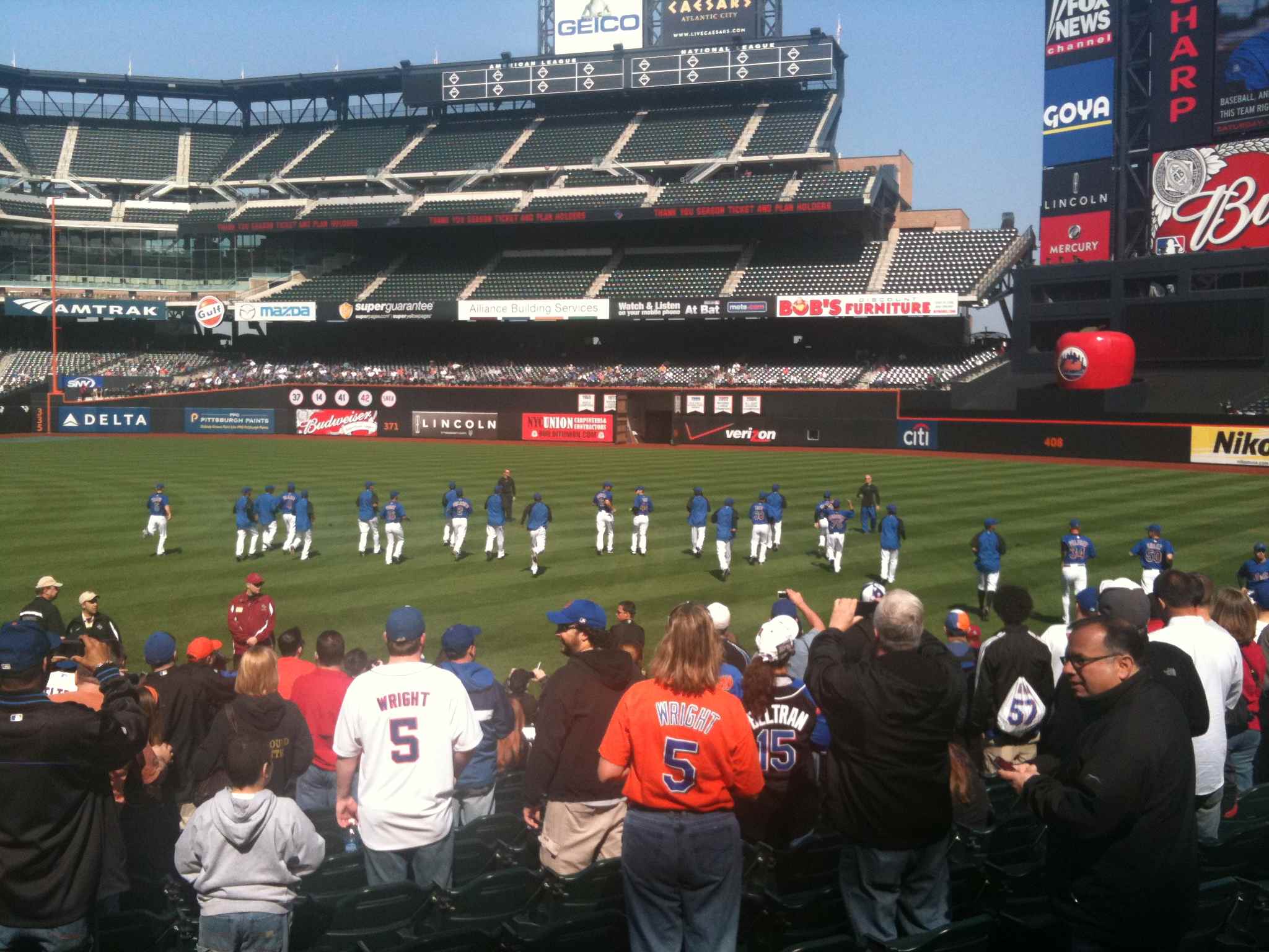
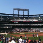
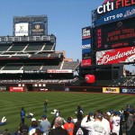
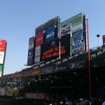
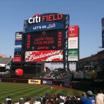
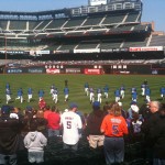
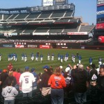
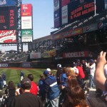


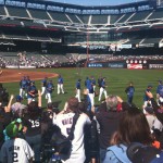
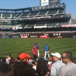
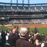

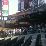
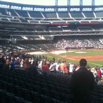
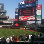
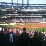
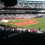
Well, your photos prove that the Mets management have to screw up something at Citi Field. Did you notice the center field wall? They didn’t lower anything but the orange line. It looks like the removed the padding above 8 feet, painted the exposed wall black, and painted the top of the 8 foot high pads orange all the way from the left field wall to the bullpen.
https://metspolice.com/wp-content/uploads/2010/04/citi-field-workout-april-4-2010-203.jpg
I can’t wait for the countless replay delays to determine if ball is out or in play. Why the hell even bother?
yes, that’s your pic Shannon. Good shot by the way.
Dirt I felt so so so good about the place that the wall didn’t catch my eye. It does seem like some video replays will be in the future.
Gotta agree with FormerDirtDart, and this is exactly what I feared would happen. An over/under line less than 3 feet from top of the actual, physical wall is both confusing and just plain goofy. Putting a stripe on the apple “silo” was perfectly understandable, but painting an imaginary wall where there’s already a real wall is silly. If they had brought the wall in a few feet, creating a significant recess or ledge, I could see doing that, but how thick is that padding, maybe 3 inches? It’s gonna be mess when someone hits a ball there.
Rest of the place looks great though. I guess we have to pick our battles.
Shannon, we can’t fault you for enjoying the moment and not noticing the wall. I really like the enlarged baseball cards. I think one thing that could still be added would be a decent sized Mets “ball” logo out on the center field scoreboard. It doesn’t have to be bigger than the “Citi Field” sign, that would be a bit much, given the sign size. If the put the log over the Citi Field sign they could get rid of the “Let’s go Mets” sign over the scoreboard