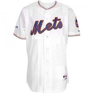
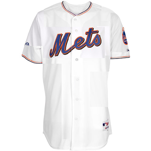
 Laurence checked in regarding the rumor that the Mets are considering removing the piping from the 2011 jerseys (and provided this mockup. Â Is everyone better at photoshop than I am?) Â Laurence says:
One way to avoid the inevitable Dodgers comparison is to look around the league and see what other kinds of piping are out there. The Angels, DBacks, Giants, Nats, Padres, and Pirates all do a subtler two-tone piping that I think is really snazzy. (Come to think of it, the Mets’ giant-NY throwbacks had it too.) Anyway, I did a photoshop hack job to see what it might look like, and I have to say, I’m hoping they look like this.

Can someone photoshop CitiField with a real dark blue outfield wall? The dark blue they have been using in all their ads and signs at stadium?
I wonder if Twins fans obsess over the green walls & seats in Target Field or if they are just happy to have a nice ballpark to go to.
That Mets jersey looks pretty good, BTW. But I still prefer just having pinstripes.
@corey This fan seems pleased
http://www.cardboardconnection.com/news/the-target-field-experience
As well they should be, it seems like a nice stadium.
My point is that I doubt that many Twins fans complain that the walls & seats aren’t Twins colors.
This is better than the Dodger uniforms…I still prefer pinstripes.
I don’t understand the desire to drop the piping from the whites. I like the Mets’ piping just the way it is. It’s distinct. It’s Mets-ian. Doing the same exact thing the Nats, Angels, Giants, Pirates, D-Backs, Padres, and Phillies (off-white alternates) do is simply the Mets continuing their 35-year-long identity crisis.
I can’t stand the above jersey. Not to offend whoever made it, but I can’t stand it. Nothing Mets-ian about it. The current piping was at least on the original road jerseys. This stuff is taken from everywhere else BUT Metsdom.
I agree, John. I’m actually pretty indifferent to the piping itself, but how do you take it away without the Mets’ jersey looking like a knockoff of the either the Dodgers’ or a dozen other teams’?
That’s why I was partial to the heavy sleeve striping in my own mockup. At least when fans see that they can think, “Hey, that looks like our old jerseys!”
Corey just take a look at the Busch Stadium tonight. See the retired numbers in LF….with added images. See the championship banners on individual flag poles with year on top? Just as classy. Mets have the opportunity to do right thing and seem have not to in that regard. And I doubt Cards did not have to be told by there fans in the 2nd year to give the stadium some history. Green is univeral color and looks nice at stadiums, like Target Field. But black? And everything all cluttered? If we can talk about uniforms we can talk about the outfield wall. Dont get me wrong I really like CitiField, I just want it to be the best it can be.
And remember the St Johns game in March 2009. Remember around the Apple there was this green turf. When regular season started it was gone so I assumed it bothered the batters. But how can the Cards have a green grass batters eye? So now CF has something that looks like black painted plywood around the apple. Cant they at least get some really dark green turf to go around it? And this is what I mean when it comes to things that have not been thought out. As the site saids, “the stupid things they do”. Blue / orange, white in various shades on the blue fit the stadium. To me, black doesnt. (and I am not the only one.)
I’m going to take a guess, and assume they pulled the turf from around the apple because the distinct color variation coupled with the apple enclosure jutting upward disrupted the batters ability to focus on a pitched ball. Since the original intent has seemed to be to have the turf out there, and that after one game was played they removed it, I’m going to go out on a limb and assume they felt they had to. And, they didn’t simply do it to annoy the crap out of the fans.
Personally, given all of the red brick used in Citi Field, I don’t think blue walls would look that good. I’ve seen a bunch of the original mock ups, and later photo-shopped versions with the wall blue…not that good a look. Frankly, I think a traditional green wall would have worked.
Whats next, a Mets vest like the Pirates / Reds have, had?
@Jesse. U know someones gonna mock a vest now and u know I’m gonna post it next Saturday.
Jesse,
The Mets have had their retired numbers and championship banners up since the place opened, so I am not sure what the issue is.
Black (officially the color is Soot and is a few shades lighter than black) is a neutral color and it’s use makes Citi unique & distinct aince noone else is using it.
When I went to a game at Wrigley Field, somehow I managed to figure out that the Cubs played there depite the green seats, ivy walls, and retired numbers tucked away on the flag poles in the corners of the stadium.
I would like to see the Mets landscape the batters eye but not having that doesn’t detract from my experience at a Mets game. However, having it would be an extra bonus to me.
Yankee Stadium’s batters eye was nothing more than painted concrete from the former bleacher seating. Did that really detract from the overall experience at YS?
When I look at pictures of Citi, I think the advertising could be less cluttered. But when I am sitting there, I am focused in on watching the game.
In 1969, somehow the Mets over came having green walls and multi colored seats to win a WS. Keep that in mind.
@Corey you should have subscribed to Mets Police 1980. It was available via self addressed stamped envelope and came on purple copy paper.
I remember my dad complaining in the May issue about them getting rid of the yellow seats, squares and the green fence. The Torre watch was amazing. That bum couldn’t manage his way out of a paper bag.
I believe this is the first time I have ever heard of someone being upset by the removal of those absurd pieces of blue $ orange painted corrugated steel panels
Corey – Great the offical color is soot……isn’t soot something we want out of our homes? lol. I believe “soot” color is used because they thought Mets blue would make the place look cheesy. I also think because Citibanks colors are blue and orange/red, Citibank wanted there logos to stand out. Remember all drawings and videos of CitiField before it was built had blue walls. Since Mets are pushing that dark blue (all signs at Stadium with that color) I think that in OF would not be cheesy and with orange line would be real sharp. Black (soot) is dull, boring and depressing. Sorry but its how I feel as do many others.
Dont think the championship banners on the wall were there when place opened. Ownership had to be told. Retired numbers…….with all that space something better could be done. Again look at Busch Stadium today in LF.
Yes low growing landscaping be nice touch around apple. Cant be too big (like Coors has) since it would block the Citibank video screen behind it. But I take dark green astroturf at this point.
Of course I watch and concentrate on the game when I am there. My view was in the age of new stadiums when you can start over and when you claim you took the best features of all the stadiums you visited, I think the Mets in many aspects dropped the ball. But I do like many of the renovations they did in 2010. And old Yankee Stadium, Wrigly and Fenway are all a whole different animal when it comes to stadiums. There charm is that they were old. However I have problems with the new Yankee Stadium. For starters I think its shameful for monument park to be behind a wall in CF under a restaurant. I would of made a section in bleachers where the monuments could be seen from the field.
Yes Shea had green wall which was fine for the times. It was also just plywood. But it was changed to blue. They also had yellow seats in lower section and that was changed to. If Citifield has green walls I be fine with it, but it would look silly with the orange lines, and Mets are only team allowed to use orange on foul poles. (Guess SF Giants could too)
Regarding flagpoles, sorry but from TV and at game I cant even see them at Citifield at first glance Its just too busy in the Pepsi section.
I think Abe Lincoln said its nice to see a man who is proud of where he lives. I think fans want to say that about their home team’s park. I think Mets ownership heard there fans and hopfully as time goes on more will be done that make it ever more the home of the Mets.
@Jesse: I believe the champ banners were in the bullpen gate when citi opened. Of course hidden unless you had just come from buying a tire.
The ones on the fence came midseason
I hope to live long enough that nothing short of a NL championship is displayed.
If the Mets ever did this, i would be offended. Why do we have to look at other teams for inspiration for a jersey? They can’t look back at pictures of 1962 and say “Hey those white pinstripe’s looked pretty snazzy with that blue hat. Same goes for the grey jersey and the blue hat. let’s go with that for the next FOREVER!!!!!!”